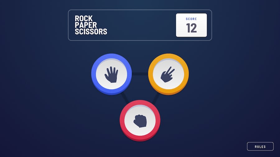
Design comparison
SolutionDesign
Solution retrospective
Hope you like this solution. Please tell me if there is something to improve in my code. Thanks you
Community feedback
- Account deleted
Hi,
I like how you included both version of the game, makes it a bit versatile & the game play is ok and pretty much works, but there's just some things;
- I like that there's a bit of animation going on but when the house choice is spinning we can already see it's decision, so it kind of defeats the whole point... Like I already know who won.
- You can at least have it change hands while flipping, it'll sure make it more interesting.
- & you could also style the switch a little bit better, give it some padding or something.
Marked as helpful0@ThanhVuong0904Posted about 3 years ago@thulanigamtee Hi thanks you for feedback <3
0
Please log in to post a comment
Log in with GitHubJoin our Discord community
Join thousands of Frontend Mentor community members taking the challenges, sharing resources, helping each other, and chatting about all things front-end!
Join our Discord
