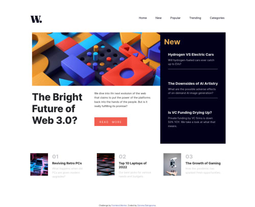
Submitted about 3 years agoA solution to the News homepage challenge
HTML 5, flexbox, grid system, SASS, Bootstrap
bootstrap, sass/scss
@Dytoma

Solution retrospective
I found it difficult to design the toggle menu for mobile devices even though I came out with something, it didn't work as expected. You can see the code to the script tag before the closing body tag and the css part is within the media query.
I don't know if that's because I use Bootstrap for my design that's why I couldn't align items properly or there was some other reasons.
I'm willing to get your recommendations, tips and advices to perfect my design.
Code
Loading...
Please log in to post a comment
Log in with GitHubCommunity feedback
No feedback yet. Be the first to give feedback on Dytoma's solution.
Join our Discord community
Join thousands of Frontend Mentor community members taking the challenges, sharing resources, helping each other, and chatting about all things front-end!
Join our Discord