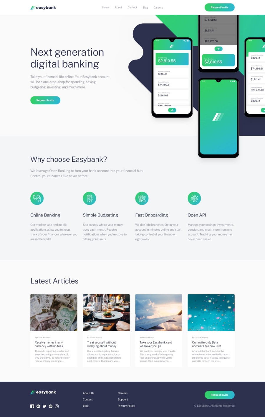
Design comparison
Solution retrospective
This is my first time using SCSS. Hope you like this solution. Please tell me if there is something to improve in my code. Thanks you!
Community feedback
- @frontendtonyPosted about 3 years ago
Design implementation in on point 👌🏽
Looking at your markup however, I noticed a pattern that you could work on improving.
- Use semantic HTML markup. For example 'Why choose Easybank?' should be a
h2tag, not adiv. - Use less markup. There are lots of unnecessary nested
divtags where just one could've worked. In each sections, you used 3 'wrapper' tags, you could've applied styles on just one to achieve the same thing - Use the
altattributes in yourimgtags to describe the image to visually-impaired users
Marked as helpful0@ThanhVuong0904Posted about 3 years ago@frontendtony Hi thanks you,
-
I know it but I don't know why I do it.
-
I'm little confused at banner section.
0 - Use semantic HTML markup. For example 'Why choose Easybank?' should be a
- @tesla-ambassadorPosted about 3 years ago
This is really awesome! You might want to consider using a class of header like elements instead of using headers to avoid the html issues otherwise, I think this is really great work! kudos
Marked as helpful0@ThanhVuong0904Posted about 3 years ago@tesla-ambassador Yeahh! Thanks you for feedback.
1
Please log in to post a comment
Log in with GitHubJoin our Discord community
Join thousands of Frontend Mentor community members taking the challenges, sharing resources, helping each other, and chatting about all things front-end!
Join our Discord
