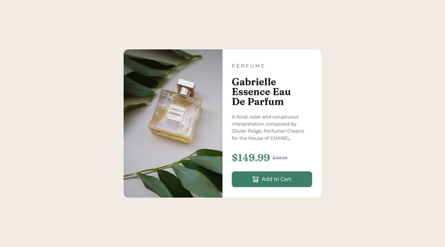
Design comparison
Solution retrospective
è stato semplice dai :)
Community feedback
- @fileccPosted over 2 years ago
Benvenuto e complimenti per aver completato la tua prima challenge! 🎉 Ho notato che hai scritto P E R F U M E per ottenere l’effetto indicato nella challenge. Prova invece ad usare:
.perfume{
    font-size: 15px;
    color: hsl(228, 12%, 48%);
    text-transform: uppercase; // trasforma tutto il testo in maiuscolo
    letter-spacing: 20px; // aggiunge spazio tra le lettere
}
e modificare ovviamente
<p class="perfume">perfume</p>avanti tutta 😁
Marked as helpful0 - Account deleted
Hey @Poebyt13, some suggestions to improve you code:
-
The Alt Tag Description for the image needs to be improved upon. You want to describe what the image is; they need to be readable. Assume you’re describing the image to someone.
-
The only heading in this challenge is the name of the perfume, “Gabrielle Essence Eau De Parfum”. The rest of the text should be wrapped in a Paragraph Element.
-
Wrap the prices in a container and use
display: flexalong withalign-items: centerto have them perfectly aligned like the FEM example. -
The old price 🏷 is not being announced properly to screen readers. You want to wrap it in a Del Element and include a sr-only text explaining that this is the old price.
-
Your button has the incorrect hover color applied. You want to look at the “style-guide” to see what the correct color is.
-
Implement a Mobile First approach 📱 > 🖥
With mobile devices being the predominant way that people view websites/content. It is more crucial than ever to ensure that your website/content looks presentable on all mobile devices. To achieve this, you start building your website/content for smaller screen first and then adjust your content for larger screens.
Happy Coding! 👻🎃
0 -
- @correlucasPosted over 2 years ago
👾Bravoooo, Congratulations on completing this challenge!
Your solution its almost done and I’ve some tips to help you to improve it:
Use the THE PICTURE TAG that is a shortcut to deal with the multiple images in this challenge. So you can use the
<picture>tag instead of importing this as an<img>or using a div withbackground-image. Use it to place the images and make the change between mobile and desktop, instead of using adivorimgand set the change in the css withdisplay: nonewith the tag picture is more practical and easy. Note that for SEO / search engine reasons isn’t a better practice import this product image with CSS since this will make it harder to the image. Manage both images inside the<picture>tag and use the html to code to set when the images should change setting the devicemax-widthdepending of the device desktop + mobile.Check the link for the official documentation for
<picture>in W3 SCHOOLS:https://www.w3schools.com/tags/tag_picture.aspSee the example below:
<picture> <source media="(max-width:650px)" srcset="./images/image-product-mobile.jpg"> <img src="./images/image-product-desktop.jpg" alt="Gabrielle Parfum" style="width:auto;"> </picture>👨💻Here's my solution for this challenge if you wants to see how I build it: https://www.frontendmentor.io/solutions/product-preview-card-vanilla-css-and-custom-hover-state-on-hero-85A1JsueD1
✌️ I hope this helps you and happy coding!
0
Please log in to post a comment
Log in with GitHubJoin our Discord community
Join thousands of Frontend Mentor community members taking the challenges, sharing resources, helping each other, and chatting about all things front-end!
Join our Discord
