Design comparison
Solution retrospective
What did you find difficult while building the project?
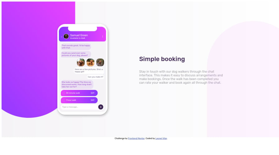
I got a lot of trouble making the screen size and it's conversation, and had to use a bit of margin to put them where they should be, i'd appreciate any feedback on that.
Community feedback
- @SouiciaPosted about 2 years ago
Hello Leonel,
Congratulation on finishing the design.
You have quiet a few problems with the design. It's not responsive, and it's not adapted to any screen sizes, but potentially the one you coded on. Now, how to remedy that? I strongly invite you to learn about responsive CSS, which is what makes CSS come alive. There are plenty, plenty, plenty of amazing CSS tutorials on YouTube, in fact, the beautiful, and amazing FreeCodeCamp just released one yesterday: https://www.youtube.com/watch?v=OXGznpKZ_sA&ab_channel=freeCodeCamp.org. It's 11 hours long, but after that! After that! Calling you the king of CSS would be an understatement. Now some pointers to help you: do not redeclare the width of the body, otherwise you'll make the body static, which is definitely not what you want. In the body, declare margin: 0. This will avoid those spaces around your design. Use width: 100%, and then set your min and max width. That's your first lesson in responsive design. Declaring width 100% is important, because then the children of that div, will know what size to be if you use % on their widths, which will make the children responsive too. Learn about media queries as well. This will make your design change depending on screen sizes.
All in all, your design is good, however, there are many improvement points, which I invite to work on after you learn responsive designs, % usage, media queries, and plenty more goodies. Have a great day! :)
Marked as helpful1
Please log in to post a comment
Log in with GitHubJoin our Discord community
Join thousands of Frontend Mentor community members taking the challenges, sharing resources, helping each other, and chatting about all things front-end!
Join our Discord