

Design comparison

Solution retrospective
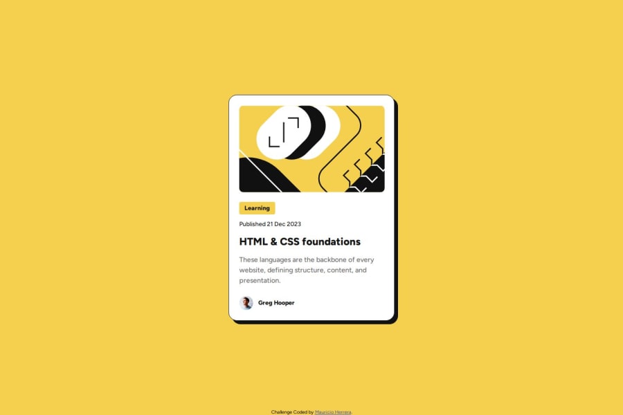
It took me like an hour to get 80% there, the hover over subclass was pretty easy to use. I liked that the figma file contained a lot of great information including the best way to name the sections of the page which I followed.
What challenges did you encounter, and how did you overcome them?Biggest challenges were the margins between the card content and the picture and the margins between each of the elements in card content didn't quite match in the figma file to what I was expecting when I was comparing my screenshots to it. I'm not sure if perhaps I used margins wrong when I should have used padding but I don't think so.
Please log in to post a comment
Log in with GitHubCommunity feedback
- @kaaato
Hello,
Your solution is identical to the original design on screenshot. Very impressive. But your preview isn't the same outcome for some reason... there was just the image and texts, no container.

Join our Discord community
Join thousands of Frontend Mentor community members taking the challenges, sharing resources, helping each other, and chatting about all things front-end!
Join our Discord