
hover effects fot the buttons, flexbox for responsive land page...


Design comparison
Solution retrospective
Hi guys!
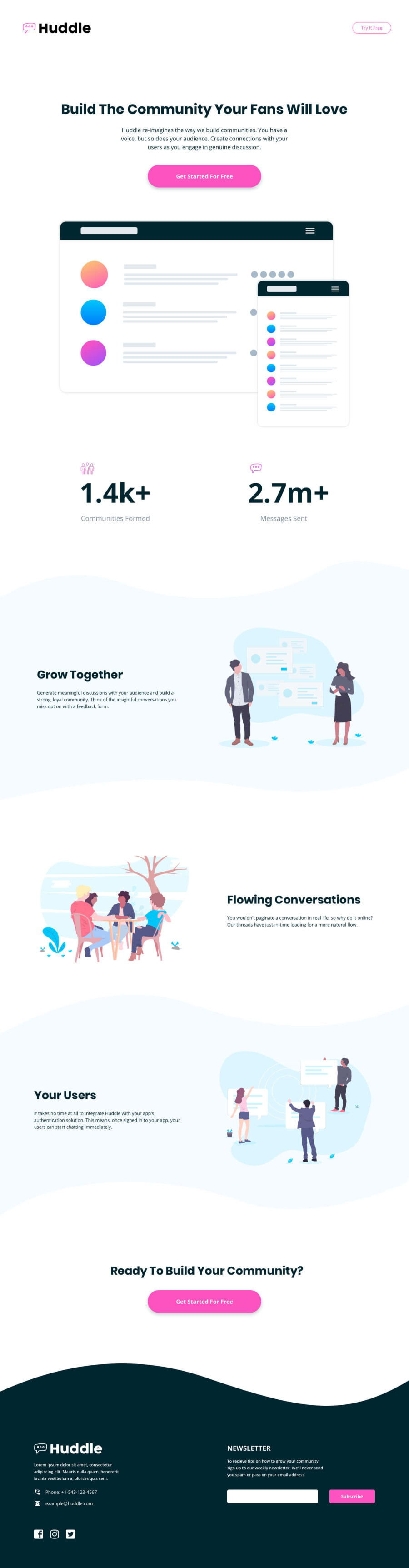
I'd like some help with the wave backgrounds because both backgrounds from the tag main and footer got distorted, I got to adapt for a mobile screen but when comes to the tablet screen the background gets a little distorted, so I hope someone checks my code and give me a feedback.
Thank you guys for all the supporting
Community feedback
- @adityaphasuPosted over 1 year ago
Hi!
Good job on the challenge!
- The problem of distortion of waves is coming due to insufficient heights of the waves when the media query is applied due to those heights the waves just cuts off.
- I think only the footer and section-3 waves have this so one way you can do to fix this just increase the
heightof the waves in themax-width:768pxa little bit and add another media query saymax-width:400pxto keep the wave heights for the mobile.(The ones you wrote for in the 768px media query) - Do it like this:
@media (max-width:768px) { .bg-wave-section3-top { background: url(../images/bg-section-top-mobile-2.svg) no-repeat; height: 13rem; } .bg-wave-section3-bottom { background: url(../images/bg-section-bottom-mobile-2.svg) no-repeat; height: 13rem; } .bg-wave-footer { background: url(../images/bg-footer-top-mobile.svg)no-repeat; height: 5.6rem } } @media (max-width:400px) { .bg-wave-section3-top, .bg-wave-section3-bottom { height: 10rem; } .bg-wave-footer { height: 2.6rem }-
I've increased the heights according to what I found to be good at those screen sizes but you can try playing around a little bit to see what feels more okay.
-
You might've noticed that I've removed
background-size: cover;from all these, it's because you are already applying this property originally (for the desktop) this still gets applied when you write the media query, and in this case it remains the same so writing them again just repeats the code.
This should be enough to fix the problem you are having 🙂
Keep coding and good luck!🙌🏻
Marked as helpful0@rug19Posted over 1 year agoThank you so much for the help, I'll repair this part. I'd like to ask you about the screenshot solution, do you know why my solution isn't cover all the screen sizes like the design?
@adityaphasu
1@adityaphasuPosted over 1 year ago@rug19 ah it's just the paddings and heights we use. See how the challenge says it's designed only for
375pxand1440pxin the style guide. They've only given designs for these widths too so the curves and all are meant for those widths so in order to maintain the design we just have to write extra css for other screen sizes. Unlike working with single components as you've done till now these are whole landing page layouts and they are bound to shift when we change screen sizes. In order to maintain the design you would eventually have to add more media queries for general screen sizes (eg.1024px,768px,375px).I know when starting out and moving to bigger challenges you would feel why the design doesn't stick and why we have to write more css but it's all part of the process! I actually quite thought the same when I started making landing pages but bit by bit this made me write css to make the pages more responsive so don't worry too much and keep it up!🙌🏻
- Tip - If you wanna match the design here on frontend mentor with the screenshot you can use an extension like pixelperfect to overlay the design image and develop accordingly. (The screenshot here is taken for
1440pxwidth so overlay the desktop version design and develop using devtools on1440pxresponsive size to get almost similar screenshot)
Keep up the hard work and good luck!
Marked as helpful0

Please log in to post a comment
Log in with GitHub
Join our Discord community
Join thousands of Frontend Mentor community members taking the challenges, sharing resources, helping each other, and chatting about all things front-end!
Join our Discord