Design comparison
SolutionDesign
Solution retrospective
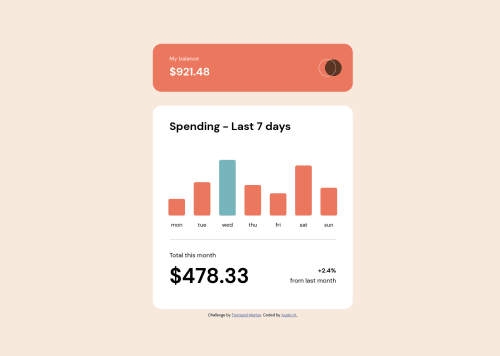
Seeing substantial improvement with styling css and javascript. However, I am still struggling with the mobile versions and getting the content centered and fully responsive to the screen size changing.
Community feedback
- Account deleted
Hello Austin, congrats completing the component. Some points regarding the responsiveness.
- When applying width or height to elements is a best practise set min or max, that will free the element from static size. The
body
element has aheigh:100vh
, try amin-height
instead. Also a fixed width is unnecessary. - It seems there is extra padding and margins on the overall component. Could be a good idea to decreasing units for both properties in several elements.
- There are elements sized with
px
and others withrem
orem
, try be consistent across your CSS, that will allow you to control the overall sizes and spacing easier. - Some
font-size
are disproportionate. For example the<h1>
nested indiv.numb-month-total
has a font-size of 60px. - Check always the automatic report generated by the plattform. In this case it seems there is duplication
id
.
I think that those points could really increase responsiveness in your project. Other than that I do really like how you styled the bar chart and the JS logic seems pretty well organized. Have a gooda weekend and see you around!
0 - When applying width or height to elements is a best practise set min or max, that will free the element from static size. The
Please log in to post a comment
Log in with GitHubJoin our Discord community
Join thousands of Frontend Mentor community members taking the challenges, sharing resources, helping each other, and chatting about all things front-end!
Join our Discord