
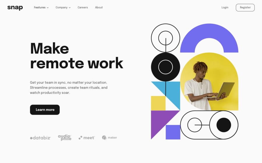
Homepage responsiva Snap, utilizando HTML, CSS, JS


Design comparison
Community feedback
- @DaFlusherPosted 12 months ago
Great work. I loved the shadow effects for the dropdown menu, I completely forgot about that in mine. I equally liked the accordion style. I loved the button hover animation, but I noticed they were not the same. The 'register' button used the translate feature while the 'learn more' button changed its background color, personally I think it's always nice for similar interactive elements like buttons to have uniform animations. The side navigation also appears instantly from the right side of the screen, maybe you can try adding an animation transition property to ease it onto the screen. There's also a bit of an mal-alignment with the login link and register button at about 1006px screen width, you can check it out. In general, its a really nice work. Cheers and Goodluck !
Marked as helpful0@viniciuskenji7Posted 11 months ago@DaFlusher Thank you very much for the feedback, I think it is very important to receive opinions and criticisms from someone more experienced, I'm just starting out and this site is very good for studying! I'll check your views and fix what's missing. thank you very much!
1

Please log in to post a comment
Log in with GitHubJoin our Discord community
Join thousands of Frontend Mentor community members taking the challenges, sharing resources, helping each other, and chatting about all things front-end!
Join our Discord