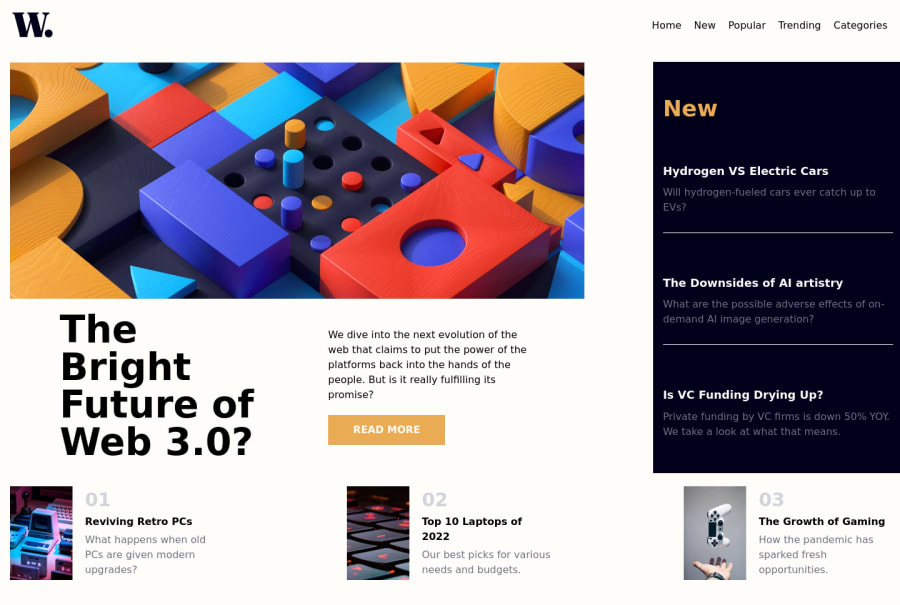
Design comparison
Solution retrospective
I can't stress enough how much fun i had doing this challenge, i don't know what it was but just the approach i had with how to place the items and what could be the best way of doing things really made it so much fun.
As always any feedback is welcome.
Community feedback
- Account deleted
Hi, when using 'flex-direction: column' ensure that the elements are aligned to the left. Also give images a 'width: 100%' instead of pixels to make it responsive, 'max-width' is only for especial cases. Cheers to complete the challenge
Marked as helpful1@SiebenlistPosted about 2 years ago@FakeAstronauta Hi! i was actually wondering if there was an easier way of resize the images, it was so simple it slipped right out my mind. I will be keeping this in mid, thank you for the feedback!
0 - @maxime927Posted about 2 years ago
Hi Sieben, how are you ? I have some tips that i hope would helps you :
-
It seams dificult to use grid with this template as I saw on multiple solutions before, why don't you stay with flexbox ? You'll be able to fix each width and space without being too much constrained with the grid structure.
-
For Designers the result is really important, pay attention to spacings and font-size as well, i can advise you to use the chrome extension : PerfectPixel
For exemple, for the News block :
- you can use an
<ul>tag to list the elements and almost no responsive style for this block as this below : HTML
<ul>
    <li>
        <a href="#" title="Hydrogen VS Electric Cars"></a>
        <h3>Hydrogen VS Electric Cars</h3>
        <p>Will hydrogen-fueled xars ever catch up to EVs?</p>
    </li>
    ...
</ul>
and styles
        ul {
          padding: 0; margin: 0; list-style: none;

          li {
            position: relative; padding: 27px 0 12px; border-top: 1px solid $dark-grey; margin-top: 18px;

            &:first-child { margin-top: 0; border-top: none; }

            a {
              position: absolute; z-index: 2; left: 0; top: 20px; right: 0; bottom: 0;

              &:hover + h3 { color: $orange; }
            }
            h3 { color: $white; font-weight: 800; font-size: 20px; margin-bottom: 8px; }
            p {color:$grey; margin: 0 0; font-size: 15px; line-height: 26px;}
          }
        }
Hope it helps...
Marked as helpful1@SiebenlistPosted about 2 years ago@maxime927 Hello! thank you for the feedback, i tried using grid in this design just because it seemed like the best way to approach the challenge, i actually thought of using only flexbox but i just stuck with grid.
I didn't know about that extension! it seems pretty useful, i'll make sure to use it on my next challenge, i actually use pesticide for chrome if i get a little lost with the layout.
1@maxime927Posted about 2 years ago@Siebenlist Usually i consider
display:gridis really usefull when it is really grids fulls of background for exemple or when we center everything in each "cell" of the grid because in other cases it causes often big vertical spaces that are not expected by the designer but I can understand your point of view, I saw this solution with grid approach that I found really good.Very interesting extension, i didn't know the one you propose :).
0 -
Please log in to post a comment
Log in with GitHubJoin our Discord community
Join thousands of Frontend Mentor community members taking the challenges, sharing resources, helping each other, and chatting about all things front-end!
Join our Discord
