Design comparison
Solution retrospective
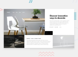
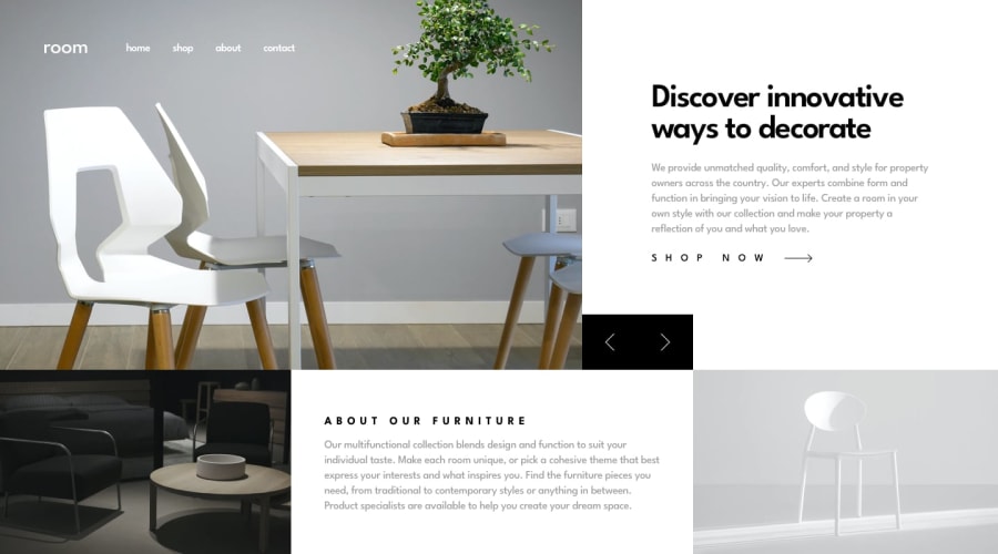
Definitely the hardest task in this project was making the span with left and right arrows fill the gap which is between the left edge of the article and the beginning of the left edge of the right picture in the fixed slide. Also I had problems with image sliding. I tried to put everything under 100vw and 100vh so my upper images are a bit stretched out.
I would like to know how I could improve the aspect ratio of the images while trying to have everything under 100vh in height and 100vw in width. Also would like to be advised on how the span containing left and right button arrows which I created could fill the gap with its width, between the left edge of the article and the begnning of the left of the right picture in the fixed slide
Community feedback
- @FoxMalder-coderPosted over 2 years ago
Hi! To make picture grow-up correctly use object-fit: cover and overflow: hidden. For positioning you could try: first 60% (wrap picture in div with width: 60%) and second 40% (left part), then set span left: 60%... It's not exactly numbers, just for example.
2
Please log in to post a comment
Log in with GitHubJoin our Discord community
Join thousands of Frontend Mentor community members taking the challenges, sharing resources, helping each other, and chatting about all things front-end!
Join our Discord
