Submitted over 4 years ago
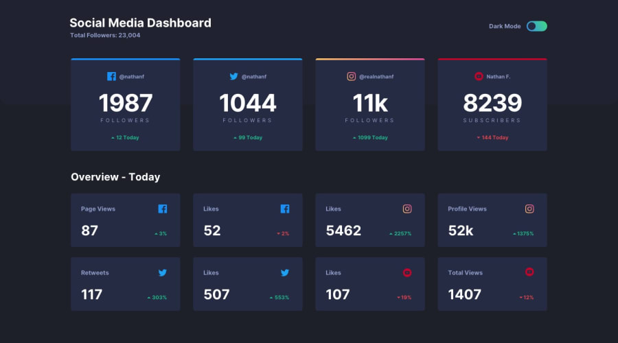
Highly responsive page using sass, with local storage.
@tusharkashyap63
Design comparison
SolutionDesign
Solution retrospective
Had a ton of fun completing this challenge. Is it okay to add a lot of media queries? Any other feedback is also welcome.
Community feedback
- @ovidiuantonioPosted over 4 years ago
Hello, your solution looks very nice! Nice job! Yes, it's fine to add a lot of media queries as long as you make the page fully responsive across all type of devices!
These are the media queries I use in every solution:
- 0-600px (mobile)
- 600-900px (tab port)
- 900-1200px (tab land)
- 1200px (large screens)
and I think they are enough, but if you feel that you need more there is no problem!
Happy coding! Keep going!
2@tusharkashyap63Posted over 4 years ago@ovidiuantonio Sounds good. What I do is while resizing the page if anything breaks I try to fix it and if not fixable, I add a media query there.
0
Please log in to post a comment
Log in with GitHubJoin our Discord community
Join thousands of Frontend Mentor community members taking the challenges, sharing resources, helping each other, and chatting about all things front-end!
Join our Discord
