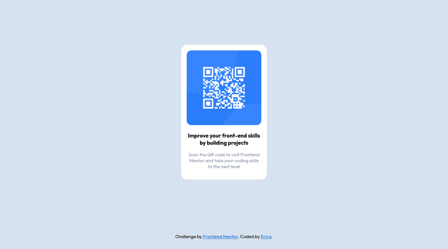
Design comparison
Solution retrospective
Hey everyone gave it a go again to make sure I'm understanding evrything. Thank you to every for feedback on my first attempt. Hopefully, this one is better and link works.
Community feedback
- @NaveenGumastePosted about 3 years ago
Hello Erica ! Congo 👏 on completing this challenge
Let's look at some of your issues, shall we:
-
Add Main tag after body
<main class="container"></main> -
Always use
h1first and thenh2,h3and so on -
For attribution use
footertag
happy Coding😀
0 -
- @GitHub-dev12345Posted about 3 years ago
Congratulation to complete the challenge ❤️👍 My small suggestion : 1.In Card design CSS Code Used this:
transform : scale(0.8); this property decrease the size of card. 😉
large size for increase the number of scale & small size for decrease the number of scale
I hope you find this helpful
0 - Account deleted
Hello there! 👋
Congratulations on finishing your challenge! 🎉
I have some feedback on this solution:
-
Always Use Semantic HTML instead of
divlike<main><header><footer>, etc for more info -
headings should icrease by one use h1 first then h2 etc..
i hope this is helpful and goodluck
0 -
Please log in to post a comment
Log in with GitHubJoin our Discord community
Join thousands of Frontend Mentor community members taking the challenges, sharing resources, helping each other, and chatting about all things front-end!
Join our Discord
