

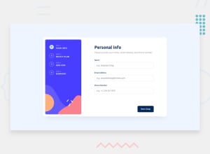
Design comparison
Solution retrospective
Responsive styles were too complicated for me, I decided to do it with react another time
Community feedback
- @GioantPosted about 1 year ago
Hey DANIDEV6,
It is understandable.
Currently, i see the form is not on the center of the screen.. and it is because there is no height given to the body. Usually, the body will only take the height of the elements inside which currently is your section and attribution elements.
you can center the form to the middle of the page by giving the body element a height value.
there are multiple ways to do this.. but one trick i use is:
min-height: 100vh.Which sets the body to 100% to a viewport's (device) height.
after you can do the following for the body in css:
flex-direction: column;
justify-content: center;
align-items: center;
which sets all elements inside the body to the middle of the page in a column layout.
Hope this helps!
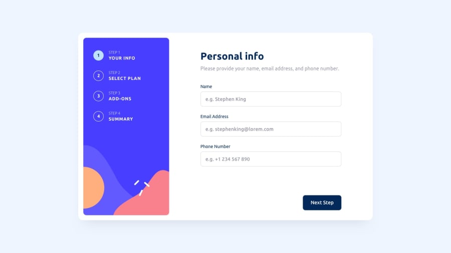
Edit: I forgot to mention for the mobile version.. I see for the mobile design image (step 1 for example) the image should be on top and then a form on the bottom.
it will be pretty hard to style the same elements currently to look like the mobile design so i suggest creating different components for mobile version.
and then conditionally show either the desktop or mobile version depending on the width of the device. You can google this but according to this link:
a common breakpoint for phones according to google is less than 480px.
you should also consider using percentages(%) instead of using fixed px sizes for width make elements and the main form somewhat responsive.
For instance making the parent container of the form to take only 90% of width would be ideal...
Marked as helpful0

Please log in to post a comment
Log in with GitHub
Join our Discord community
Join thousands of Frontend Mentor community members taking the challenges, sharing resources, helping each other, and chatting about all things front-end!
Join our Discord