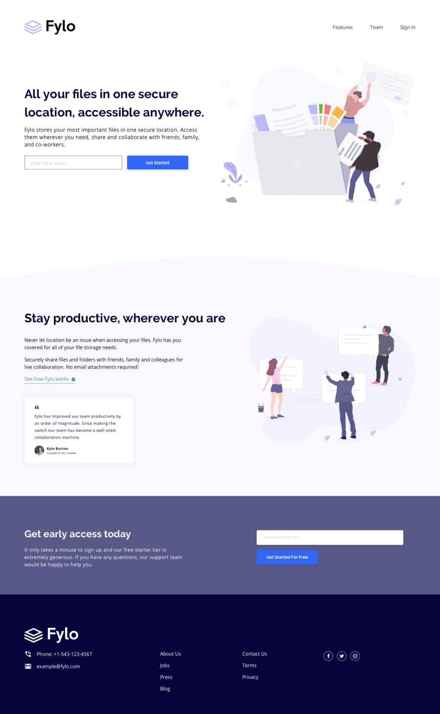
Design comparison
Solution retrospective
Does it look okay on the mobile phone?
Community feedback
- @manerotoPosted almost 5 years ago
I like too much the way you did it, great work!. I recommend you to pay attention to the alt attribute of the image, also to the aria-label of the inputs. The testimonial looks too tight and the images are stretching because of the flex, maybe an align-items: flex-start should do the work. In the mobile view the menu looks different and the menu items are too close to each other. The testimonial image is bigger than what it should. Finally, it would be great if you try to give some hover animation and interactions all around the page. I hope my comments helped to improve your skills. It would be nice if you can review my solutions (the one that I already have and the coming ones).
1 - @mattstuddertPosted almost 5 years ago
Nice work, Ihor! The overall layout looks great. I'd recommend just doing a few styling refinements with spacings just to get it looking as close to the design as possible. The mobile layout looks good too, there are just small tweaks to be made like the navigation links going out of position.
I'd also recommend taking a look at the accessibility errors as well. Building accessible websites is a key part of being a front-end developer.
Let me know if you have any questions. Keep up the great work!
0
Please log in to post a comment
Log in with GitHubJoin our Discord community
Join thousands of Frontend Mentor community members taking the challenges, sharing resources, helping each other, and chatting about all things front-end!
Join our Discord
