Design comparison
SolutionDesign
Solution retrospective
What are you most proud of, and what would you do differently next time?
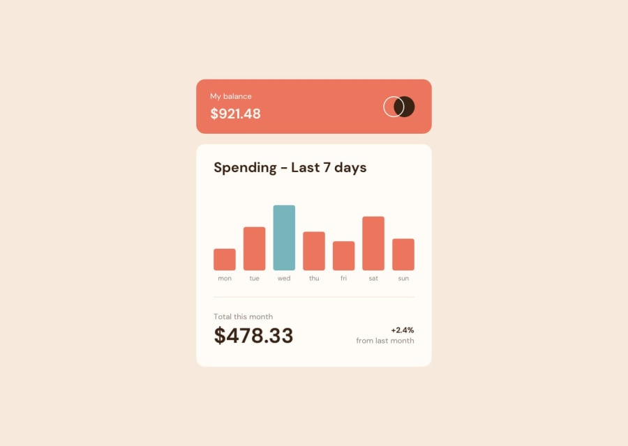
Had to some vanilla css on this one. Statisfied with the result. Data is all dynamic and animated. Biggest amount gets highlighted.
Please log in to post a comment
Log in with GitHubCommunity feedback
No feedback yet. Be the first to give feedback on Heahl's solution.
Join our Discord community
Join thousands of Frontend Mentor community members taking the challenges, sharing resources, helping each other, and chatting about all things front-end!
Join our Discord
