Hangman (React + TypeScript + Vanilla CSS)
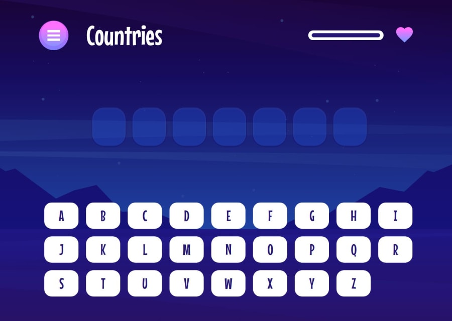
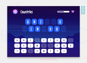
Design comparison
Solution retrospective
Whew - I put a bit of effort into this one! Some of the things I did or paid attention to during the development of Hangman:
- Added some subtle animations to make the app a little more lively/fun. Nothing major. For example, on the 'How to Play' page, each of the 'How to Play' steps zooms onto the page on load, and on the main game page, when the player loses a life, the life meter animates instead of jumping lives.
- Added keyboard accessibility: Users are able to completely use their keyboard if they wish, including pressing
Escto open the Pause menu, pressingEnterto start the game, and pressing letter keys to play a letter. I had to use a menu focus package to ensure that, when the user tabs through the pause menu, the tab focus stays on the menu buttons only (rather than going off into the rest of the app behind the menu). - Error message when category is out of words: When the current category runs out of words and the player tries to play that category again (i.e. by pressing 'Play Again' or by clicking that category's button), a message appears telling the player that the category is out of words, and to either choose a different category or to refresh the game to start fresh. When the player presses the 'Ok' button, they are taken to the Categories page to choose a new one.
- Replaced 2 categories: 'Sports' and 'Animals' were just a little too boring for me. I replaced them with 'Difficult Words' (which has words that are notoriously difficult to play in Hangman), and 'Wizarding World' (which is a Harry Potter-themed category that includes names, quotes, and phrases).
- Close design match: I had access to the Figma design files, and I put them to good use, getting the designs as close as possible across all 3 screen sizes.
- Word duplication rules: The winning word/phrase doesn't get played again if a) the word/phrase was just played, or b) the player has already won with that word/phrase.
- Line separations: I utilized a function to ensure that the winning word/phrase fits, no matter the screen size, by splitting the words up under certain conditions.
- Tests: I added automated tests for all of my components and hooks.
- CSS Variables: I utilized CSS variables to assist with colors that were used multiple times.
I also did my best to pay attention to best practices, including utilizing 'Separation of Concerns' by separating logic into custom hooks, adhering to 'DRY' and 'Single Responsibility Principle', using barrel imports, organizing my files with a folder structure, and more.
Feel free to check out my code and critique it - I'm always down to hear how I can improve!
Community feedback
- @tsotneforesterPosted 13 days ago
Really nice work! 🌟 on minor thing to consider: my laptop screen is 1600*900 and I see horizontal scroll doe to
width: 100vwoninfo-page-background0 - @mrvicthorPosted 4 months ago
Hi @Risclover, brilliant work here. However, while testing the app, all letters appear to be hidden. Hence, no hint on what the actual word/phrase may be. Can you investigate this. Thanks
0@RiscloverPosted 4 months ago@mrvicthor Hi Victor, can you please elaborate on what you mean by that? The letters are "hidden"? When I test the game, nothing seems amiss.
0@mrvicthorPosted 4 months ago@Risclover I meant that all the letters appear to be hidden. I thought some randomly selected letters should be hidden. Hence, users have some sort of clue about the actual word/phrase.
0@RiscloverPosted 4 months ago@mrvicthor I still don't know what you mean? This is how the challenge was meant to be done. The category itself is meant to be the "clue", so to speak. That's the nature of Hangman; you don't have a hint other than the category, and you have to use your wits to figure out the answer based on the letters that the word does or doesn't have. 😊
If you're referring to how the challenge shows some letters in the screenshot, that's because the player in that game has already guessed those letters correctly, hence them being revealed.
Edit: Ahh yes, I looked at your Hangman solution, and see now that this is indeed what you meant. Yeah, you're not supposed to provide any of the letters in the answer like that. The entire word/phrase is supposed to be blank. Hope this helps!
0@mrvicthorPosted 4 months ago@Risclover Thanks for clarifying. I think I may have been mistaken. We learn everyday 😂
0@RiscloverPosted 4 months ago@mrvicthor Hey no worries! I left a comment on your solution (since I was checking it out anyway, thought I might as well).
1
Please log in to post a comment
Log in with GitHubJoin our Discord community
Join thousands of Frontend Mentor community members taking the challenges, sharing resources, helping each other, and chatting about all things front-end!
Join our Discord
