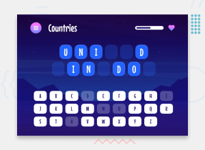
Hangman Game with React, TypeScript, React Router
Design comparison
Solution retrospective
I initially wanted to use a state manager for this project, but I decided to stick with the built-in features for state management. I ended up using Context API and useReducer. The result looks great, though the logic (context/GameContext.tsx) feel a bit cluttered.
The design file included elements with 'corner smoothing,' but CSS doesn't natively support this feature. To achieve the desired effect, I used a library. While it worked well, it has some flaws, such as having overflow: hidden by default, which prevented me from using it on certain elements.
How does my folder structure look? Each /view/ folder contains its own /components/ folder, holding components that are specific to that view and won't be reused elsewhere.
As i mentioned, GameContext.tsx might look a bit cluttered? I can navigate the file without any problems, but that might be because I wrote it :D. Any tips? Or is it okay overall?
Community feedback
Please log in to post a comment
Log in with GitHubJoin our Discord community
Join thousands of Frontend Mentor community members taking the challenges, sharing resources, helping each other, and chatting about all things front-end!
Join our Discord
