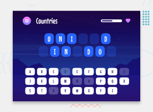
Hangman Game App in Angular v18 w/ NgRx Signals & Angular Animations
Design comparison
Solution retrospective
During this Frontend Mentor challenge I had the opportunity to delve into the new features introduced by the Angular framework with release of version 18. This project allowed me to explore and apply advanced tools from the Angular ecosystem that I had never used before, significantly enhancing the UX of the application.
- Angular Animations : to add animations and transitions based also on state.
- NgRx signal based : to a reactive state management.
I gained a lot of practice in creating shared reusable component., for example:
- a versatile ButtonComponent that could be used both as a button ,to trigger specific actions on click, and as a link for redirects, maintaining the correct semantic of these elements.
- a reusable MenuComponent, to allow customization of the menu sections, like header and content items, I opted for composition using ng-template, defining and exposing references to this composable templates via structural directives.
Thanks to NgRx, I was able to maintain a well-organized folder structure and ensure total decoupling between the application's logic and application's view and data rendering:
- The logic was defined declaratively and provided as a service to the application
- Data rendering and management of input events from the UI were handled through smart and dumb components, accessing pieces of state and derived state from the store, and calling actions of the store to update state in the events handling.
I would love to get some feedback from you. Your insights would be incredibly valuable in helping me improve. Here are a few specific areas where I'd appreciate your thoughts:
-
Folder Structure Management:
- How effective is the current folder structure?
- Are there any changes you would suggest to improve organization and maintainability?
-
State Design and Action Management:
- What do you think about the design of the state and the way actions are managed?
- Are there any best practices or improvements you would recommend?
-
Shared and Reusable UI Components:
- How well do the shared components (e.g., ButtonComponent, Menu) work?
- Are they flexible and reusable enough for different use cases?
-
SCSS Organization:
- How is the SCSS part of the application organized?
- Do you have any suggestions for better structuring or optimizing the SCSS?
-
Possible Improvements or Suggestions:
- Do you have any general feedback or suggestions for improving the solutions I've implemented?
- Are there any areas where you see potential for enhancement?
Thank you so much for taking the time to review my work. Your feedback is greatly appreciated ❤️.
Happy code to everyone!! 😁
Community feedback
- @hebaahmedsalehPosted 9 months ago
amazing work but how you choose this screenshot when the first page is another one ?
0@FerdinandoGeografoPosted 9 months ago@hebaahmedsaleh thanks heba: as the initial read-me.md of the challenge suggests, I loaded the solution ensuring that the app and its state were already initialized with the word of the screen so that the site presented that screen upon first access, subsequently I remodified the state to show it normally and I re-deployed the application, using ngrx and having the state management in a single service, luckily it was quick
0
Please log in to post a comment
Log in with GitHubJoin our Discord community
Join thousands of Frontend Mentor community members taking the challenges, sharing resources, helping each other, and chatting about all things front-end!
Join our Discord
