Design comparison
SolutionDesign
Solution retrospective
Hello there,
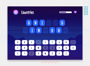
Here is my solution for the hangman challenge, made with react(vite), tailwindcss and zustand.
Don't hesitate to tell me if you see css errors or encounter bugs, as i am still tracking those. I intentionnally centered the keyboard part for aesthetics
Maybe in the future i will add a way to add further categories with an api but for now it's not a priority.
I may not have yet updated the router back to the right state, so please wait for it
Community feedback
Please log in to post a comment
Log in with GitHubJoin our Discord community
Join thousands of Frontend Mentor community members taking the challenges, sharing resources, helping each other, and chatting about all things front-end!
Join our Discord
