


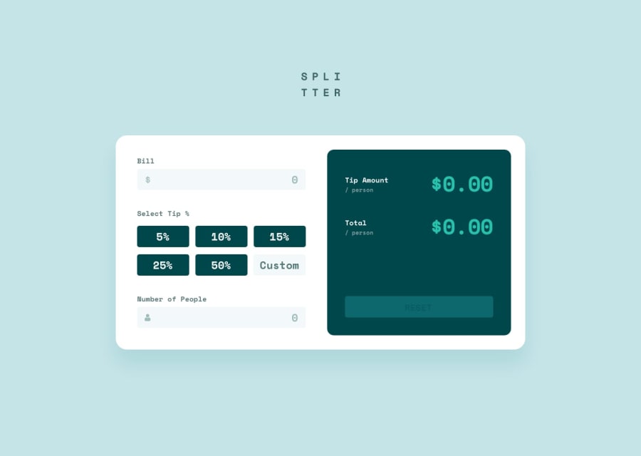
Design comparison
Solution retrospective
Still a newbie in JS so this was quite the challenge... Had fun tho, and lots of hair pulling as well 😅
Community feedback
- @pikapikamartPosted about 3 years ago
Hey, great work on this one. The layout in desktop is fine, mobile is fine as well, but I agree with Teegamtee about the responsiveness. You need to make the layout scalable to screen changes.
Some other suggestions would be:
navelement on this one is not advisable, since there aren't any navigational links being used. Use adivorheaderon thewebsite logo.- The website logo should also have
alt="splitter"as the value. Avoid using words that relates to "graphic" like "logo, image, icon.." as the value foraltattribute. Assistive tech will handle those for you. - I wouldn't nest all the layout inside a
formI would nest only the left part of the layout but not the right part. - Avoid using multiple
h1on a webpage. Only use 1, on this challenge, theh1would be a lot better if this was a screen-reader onlyh1. You might want to search about screen-reader only text. - The
labelelements are good, but you forgot to add theidattribute on theinputelement where thelabelpoints to. - The dollar-icon and the person-icon should have used
alt=""on them, since those images only acts as a decoration. If an image is used only for decoration, usealt=""on it, if the image adds to the content, then use a descriptivealt. - It would be great to have a visual indicator for each
inputelement, anoutlineorborderwould be really great in their:focus-visiblestate. This way users would know where they are currently at when navigating your website. Also on theradiobuttons, it would be a lot better if those were nested inside afieldsetelement along withlegend. This way users would know what these set of radio buttons are for. A hint as well for making a visual indicator on theinputthat is nested inside alabel:
label:focus-within { # use the class for the label that nest the `input` apply the visual indicators }- You are missing a
labelfor the people input. - The result numbers should have just used a
ptag on it and not a heading, especially noth1.
Also, I find this challenge quite hard especially accessibility, since data changes for every keypress.
Lastly, just adjust the mobile breakpoint, the
375pxis just design, it is not the mobile breakpoint.Aside from those, great work.
Marked as helpful1@aanacifPosted about 3 years ago@pikamart Wow dude, Thank you so much for taking the time and going through all those details. Such good info.
I did some adjusting, went through most of it.. Only thing I left out was the fieldset part, as that would require more deep adjustments, so I'll either do it later or keep that in mind for my next project....
Again, thank you so much, see you around ;)
1 - Account deleted
I shouldn't be able to enter a negative number on all of the fields because it just doesn't make sense.
And you solution is not responsive, well not until you reach 375px, so basically it's not responsive and that should be fixed.
Marked as helpful1@aanacifPosted about 3 years ago@thulanigamtee You're right, buddy. Thanks for the heads-up. I fixed some of it ;)
0

Please log in to post a comment
Log in with GitHub
Join our Discord community
Join thousands of Frontend Mentor community members taking the challenges, sharing resources, helping each other, and chatting about all things front-end!
Join our Discord