Design comparison
SolutionDesign
Solution retrospective
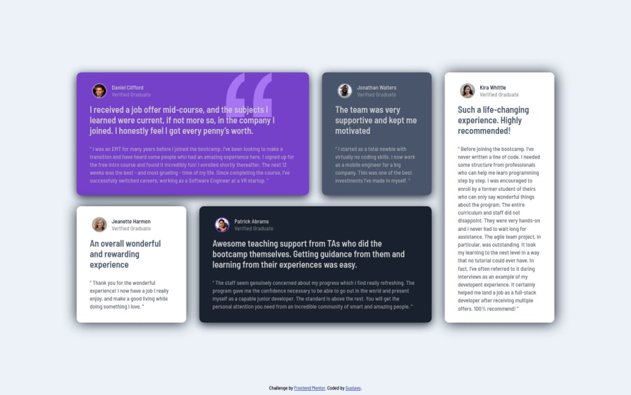
The website ended up a little bit different, but I think overall looks good.
Community feedback
- @codewithahad01Posted over 2 years ago
the main things is your component are not responsive. your components are spreading in different screen sizes try to use flex or CSS grid for taking care of different screen sizes or use a frame work like sass, bootstrap and tailwindcss. the font sizes are the same in different screen sizes.
Marked as helpful0
Please log in to post a comment
Log in with GitHubJoin our Discord community
Join thousands of Frontend Mentor community members taking the challenges, sharing resources, helping each other, and chatting about all things front-end!
Join our Discord
