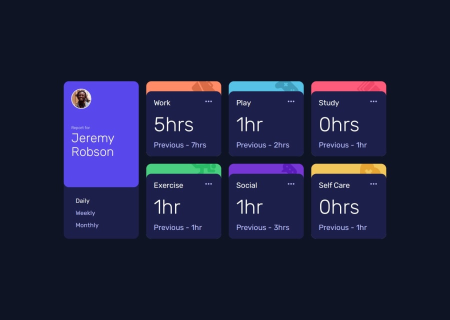
Design comparison
SolutionDesign
Solution retrospective
What are you most proud of, and what would you do differently next time?
Displaying the right elements
What challenges did you encounter, and how did you overcome them?None
What specific areas of your project would you like help with?My JS isn't perfect, I think it can be improvised but I nailed it.
Community feedback
- @sivaprasath2004Posted about 1 year ago
Hello, I would like to extend my congratulations on completing this challenge.
- I will see in your solution
preview sitethere is can be something miss in your CSS. - You will not hide in the
.inactive details.Add the following style add your CSS.
.inactiveDetail{ display:none; } .previous{ font-size:1rem; //In this size will be prefect }1@KevinBlyweertPosted about 1 year ago@sivaprasath2004 thanks, I just noticed that visibility: collapse doesn't work the way it should on another browser. I'll check ;)
0 - I will see in your solution
Please log in to post a comment
Log in with GitHubJoin our Discord community
Join thousands of Frontend Mentor community members taking the challenges, sharing resources, helping each other, and chatting about all things front-end!
Join our Discord
