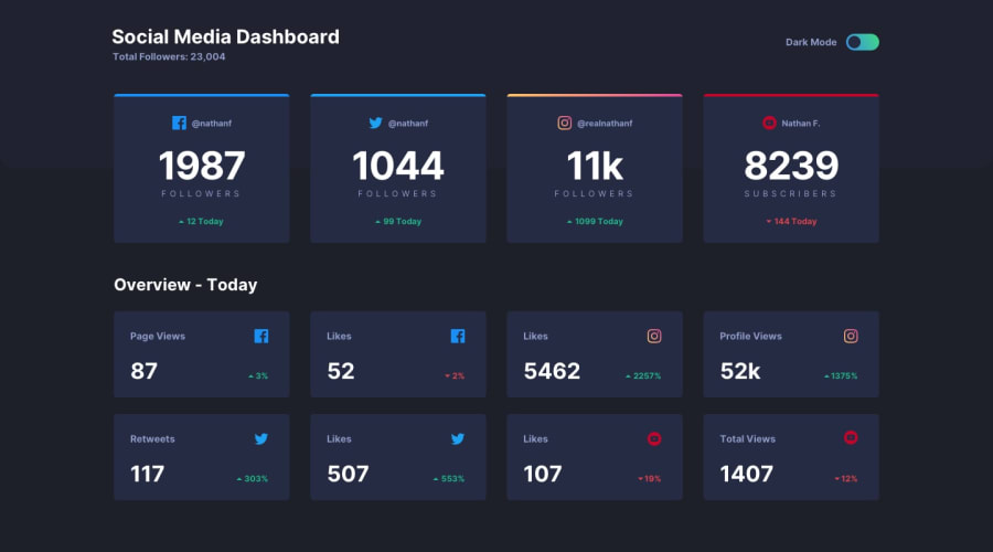
Design comparison
SolutionDesign
Solution retrospective
Any suggesstions/criticisms are welcome.
Community feedback
- @GerbenDolPosted over 4 years ago
Great use of grid Safa!
Your solution is looking spot on. 👌
Minor stuff I noticed:
- The circle in the toggle looks to be slightly off (as in... like 1 pixel) It has just a tiny bit less space to the sides than the top and bottom have
- Animation on the switch of the toggle (so moving the circle) could be a bit faster/snappier, to match the colors switching
That's all, really. Very well done! 😁
2@safrukPosted over 4 years ago@GerbenDol Thanks :) really glad for the feedback.
You are right. I'd noticed the toggle was a bit off. I forgot to fix it 🤦♀️. will fix that.
OK I'll reduce the transition time. Thanks!!
1
Please log in to post a comment
Log in with GitHubJoin our Discord community
Join thousands of Frontend Mentor community members taking the challenges, sharing resources, helping each other, and chatting about all things front-end!
Join our Discord
