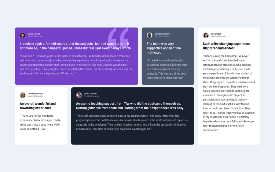
Design comparison
Solution retrospective
When creating responsiveness, I don't actually know how to adjust the grids. So, any feedback regarding it will be helpful.
Community feedback
- P@palgrammingPosted over 3 years ago
With cards of different sizes grid template areas allow you to rearrange the layouts to fit the range of screen widths with ease well a few lines of code for each transition https://www.smashingmagazine.com/understanding-css-grid-template-areas/
Marked as helpful1 - P@axseingaPosted over 3 years ago
Hi Rasil,
Congrats on finishing this challenge. Your solution looks nice, I would only use a little bit bigger font size on mobile as it is hard to read at the moment.
I am not sure if I got your question right but I try to answer. If you want you could add some media queries for the tablet as well (like two columns), the way you use grid is alright, if you want to manipulate the grid elements easier you can read about grid template areas. To make it more responsive you can use fractional units or percentages. You can read more about it here
I hope that answers your question :)
Keep coding!
Marked as helpful1
Please log in to post a comment
Log in with GitHubJoin our Discord community
Join thousands of Frontend Mentor community members taking the challenges, sharing resources, helping each other, and chatting about all things front-end!
Join our Discord
