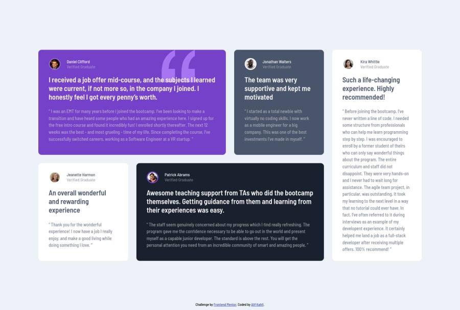
Design comparison
Solution retrospective
hello, this is my solution for the testimonials grid section main challenge. Any feedbacks are welcome:)
Community feedback
- @AdrianoEscarabotePosted almost 2 years ago
Hi Alif Kahfi, how are you? I really liked the result of your project, but I have some tips that I think you will enjoy:
You have used <br> , using <br> is not only bad practice, it is problematic for people who navigate with the aid of screen reading technology. Screen readers may announce the presence of the element. This can be a confusing and frustrating experience for the person using the screen reader. You can read more in MDN.
Prefer to use
max-widthon the element you want to do the line break!Avoid using
px, If your web content font sizes are set to absolute units, such as pixels, the user will not be able to re-size the text or control the font size based on their needs. if you want to keep using px for development and then format the whole code to rem, you can use this vscode extension: px to remThe rest is great!
I hope it helps... 👍
1@AlifkmPosted almost 2 years ago@AdrianoEscarabote thank you for your feedback, I don't know if using
<br>is not good for the screen reader. Your explanation means a lot to me 😁👍👍1
Please log in to post a comment
Log in with GitHubJoin our Discord community
Join thousands of Frontend Mentor community members taking the challenges, sharing resources, helping each other, and chatting about all things front-end!
Join our Discord
