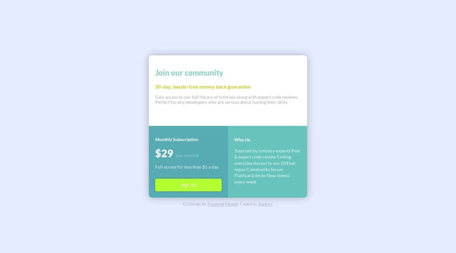
Design comparison
Solution retrospective
I'm proud of starting out with grid layout and trying new things. Also I've found it important not to freak out when something isn't working, instead to understand that it's all part of the job and it's normal. Googling stuff is another great skill I'm developing more and more.
What challenges did you encounter, and how did you overcome them?Viewport units and making grid responsive, and positioning of that attribution thing. I've watched a couple videos on units and grid, afterwards I just took my time and optimized my code by questioning why I did this and that.
What specific areas of your project would you like help with?Organizing my code and picking cleaner ways to select items. Responsive design and picking the right units.
Community feedback
Please log in to post a comment
Log in with GitHubJoin our Discord community
Join thousands of Frontend Mentor community members taking the challenges, sharing resources, helping each other, and chatting about all things front-end!
Join our Discord
