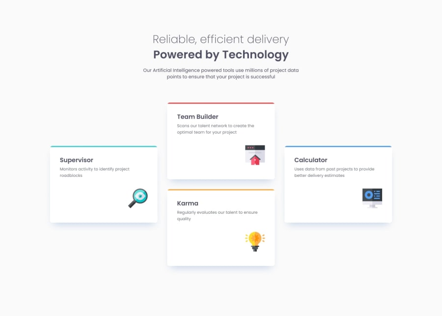
Design comparison
SolutionDesign
Community feedback
- @defPhisyPosted 9 months ago
Hey Hoaxilog, your solution looks great:
- Does the solution include semantic HTML? Yes!
- Is it accessible, and what improvements could be made? Yes, but i would suggest to leave the alt text from the svg icons, because i think they are just cosmetic and screenreaders don´t need this information, they already get it from the headings.
- Does the layout look good on a range of screen sizes? Yes, i like your middle layout with 2x2 cards. Only your mobile view could get a bit tweaking. The headings have to little line height.
- Is the code well-structured, readable, and reusable? Yes.
- Does the solution differ considerably from the design? The font-weight of your normal text is a bit off.
Marked as helpful0@HoaxilogPosted 9 months ago@defPhisy thanks for feedback! ye the text in the mobile perspective is also irritating me, will refactor that after. thanks!
0
Please log in to post a comment
Log in with GitHubJoin our Discord community
Join thousands of Frontend Mentor community members taking the challenges, sharing resources, helping each other, and chatting about all things front-end!
Join our Discord
