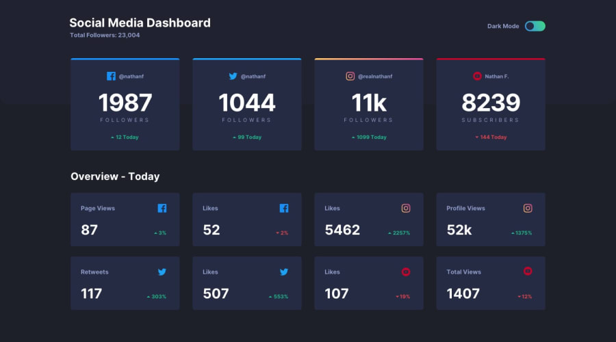
Design comparison
SolutionDesign
Solution retrospective
Pieces of advice are more than welcome!
Community feedback
- @ApplePieGiraffePosted almost 4 years ago
Hey, Vytautas! 👋
Nice to see you complete another challenge! Great job on this one! 👍
Your solution looks good, the light/dark themes work well, and the design responds very nicely! 👏
I only suggest making the toggle-switch tabbable so that it can be accessed and used by keyboard users. 😉
Keep coding (and happy coding, too)! 😁
1@vytkuklysPosted almost 4 years ago@ApplePieGiraffe Hey, thanks a million for your advice on making toggle-switch tabbable! 👍
1
Please log in to post a comment
Log in with GitHubJoin our Discord community
Join thousands of Frontend Mentor community members taking the challenges, sharing resources, helping each other, and chatting about all things front-end!
Join our Discord
