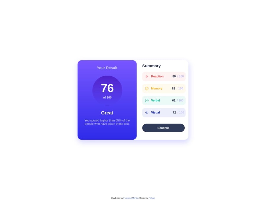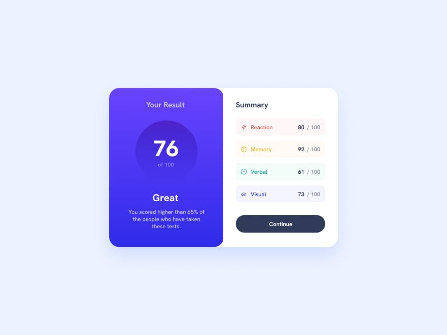
Design comparison
Solution retrospective
It was pretty difficult to position element, but one thing I really found stressing was the circle (border-radius) with lineal-gradient, I hate that thing.
Community feedback
- @aaronkaganPosted over 1 year ago
Hi your card looks beautiful but when in mobile the alignment is not aligned on the column. Have a look at alignment of the grid with align-items: center; on the .content in your media query.
For the future it might have been easier to use a flexbox for the content element rather than grid. That way you could just switch the flex-direction to column rather than the complication of grid areas.
0
Please log in to post a comment
Log in with GitHubJoin our Discord community
Join thousands of Frontend Mentor community members taking the challenges, sharing resources, helping each other, and chatting about all things front-end!
Join our Discord
