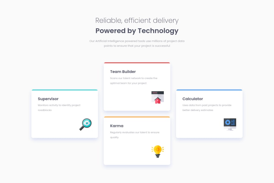
Design comparison
Solution retrospective
I used Sass for this project and was not sure about the directory structure. Is it good enough? Secondly how to get close to that shadow on cards without the sketch files? (I tried my best)
Community feedback
- @grace-snowPosted almost 4 years ago
Hi
This looks good but the html needs a lot of reworking to use semantic elements and fix the errors in the report. It's very important for search engines and assistive technology to use well structured semantic html - they would not be able to read this at the moment
Also, make sure font size is in rem/em, never in px as that will not scale well for people with different zoom settings
I recommend you read more about css specificity and reduce the nesting in your scss/css. It is a very common problem when people are first learning scss. You want to keep specificity as low as possible in css which means you should only nest selectors in scss when absolutely necessary.
I hope this advice helps
Marked as helpful0@Manmohan7Posted almost 4 years agoHi @grace-snow
Thanks for taking out the time to check out the project. Regarding the semantic syntax, how can I improve it? Where can I get more practical examples rather than theoretical explanations? We can connect separately as well.
Thanks again :)
0@grace-snowPosted almost 4 years agoTry and read up about it @Manmohan7
For example, text should never be in a div or span alone, always a meaningful element. What you have as 2 headings on this project should be either one heading (my preference) or one h2 then a h3, or a h2 then a paragraph. Really try to think about the meaning of elements in your document structure.
It takes a bit of practice but becomes automatic in time with practice
0@Manmohan7Posted almost 4 years agoYup makes sense. Should have used an H3 after H2. Thanks for pointing it out.
0 - @Manmohan7Posted almost 4 years ago
Thank you palgramming 😁 Two cards in two columns sounds interesting. Will try it out and get back to you.
0 - P@palgrammingPosted almost 4 years ago
Without the design files you did great 🌟🌟🌟🌟🌟 if you want to challenge yourself more make a middle transitions for tablet users and small screen desktop users. The cards in two columns of two
0
Please log in to post a comment
Log in with GitHubJoin our Discord community
Join thousands of Frontend Mentor community members taking the challenges, sharing resources, helping each other, and chatting about all things front-end!
Join our Discord
