Submitted over 1 year ago
Grid, Flexbox, Media Query, Padding, Margin, etc.
@ManikMaity
Design comparison
SolutionDesign
Solution retrospective
-
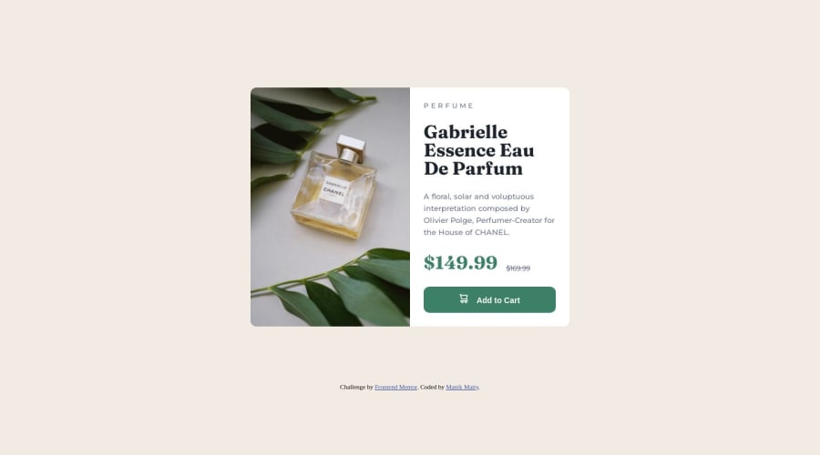
I find it difficult to make the width of the card in percentage for mobile view. when i set the width of .main-container to persecentage like (width : 90%) in @media the card is not center anymone. dont know why?. So I just set the width 330px. But If you reduse the screen size to less then 350px then the card dont look good.
-
I cant properly vertical align the cart icon with the "add to cart" text.
Community feedback
Please log in to post a comment
Log in with GitHubJoin our Discord community
Join thousands of Frontend Mentor community members taking the challenges, sharing resources, helping each other, and chatting about all things front-end!
Join our Discord
