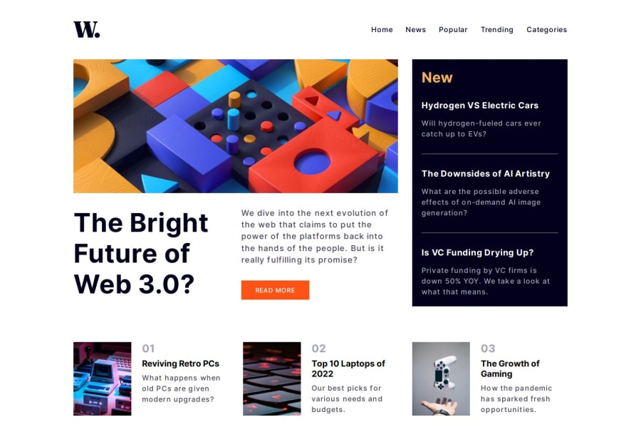
Design comparison
Solution retrospective
The section with 3 by 4 images kicked my butt. Because of the size of the image, it was a bit challenging. The image looked really bad if the width of the container with the image was greater than 300 pixels. Any ways, overall, how does it look? Any input will be greatly appreciated. Thank you very much.
Community feedback
- @CodeWithAlaminPosted about 1 year ago
Hi @shinhosuck,
Overall, you did a great job! The website looks great. However, I have a few suggestions for you.
You should use anchor tags
<a>instead ofdivwhere a user expects to click.
Example before:<div class="hero-contents"> <div class="hero-content"> <h3 class="hero-content-title">Hydrogen VS Electric Cars</h3> <p class="hero-content-paragraph">Will hydrogen-fueled cars ever catch up to EVs?</p> </div>Example after:
<a href="#" class="hero-contents">
    <div class="hero-content">
    <h3 class="hero-content-title">Hydrogen VS Electric Cars</h3>
    <p class="hero-content-paragraph">Will hydrogen-fueled cars ever catch up to EVs?</p>
</a>
Overall, this is a very well-done solution to the challenge. Great job!
Hope my suggestions were Helpful! 👍
Keep up the good work! 😊❤️
0@shinhosuckPosted about 1 year agoYou are right. Those elements you have pointed out should be click-able. Thank you very much.
0
Please log in to post a comment
Log in with GitHubJoin our Discord community
Join thousands of Frontend Mentor community members taking the challenges, sharing resources, helping each other, and chatting about all things front-end!
Join our Discord
