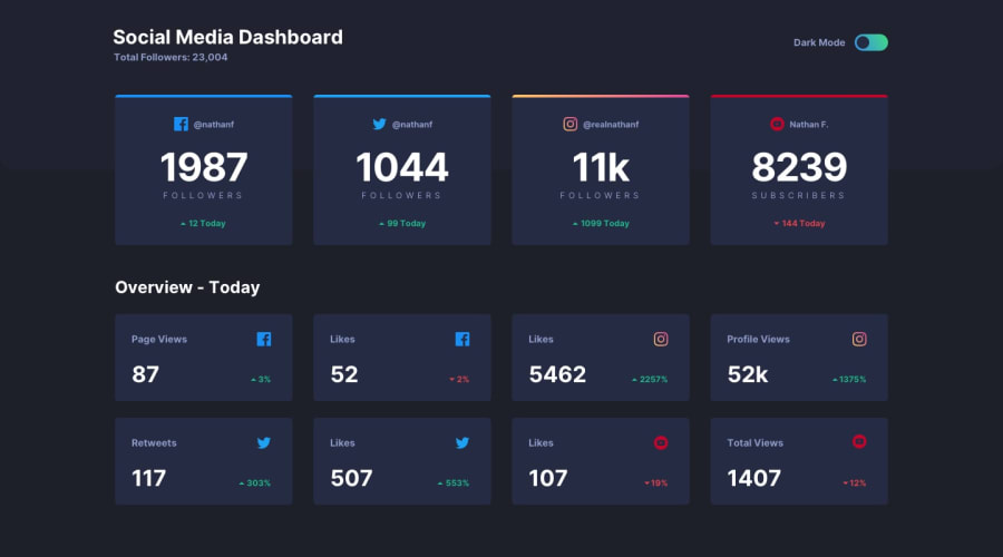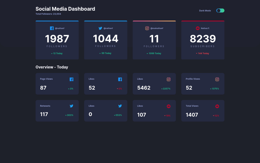
Grid, Flexbox, BEM, Mobilefirst approach, Sass and Vanilla Js
Design comparison
Solution retrospective
This was the most fun I had with the challenge.
My question for the community is how do you like my Js approach to the challenge? Is it a better idea to make a separate class for the light and dark card theme and make a separate function?
I don't have any specific questions for the community but a code review would mean a lot! :D
Also shoutout to the incredible youtube videos that helped my finish this project with this input hack: https://codepen.io/mburnette/pen/LxNxNg, and Kevin Powell for theme toggle https://codepen.io/kevinpowell/pen/EMdjOV
Community feedback
- @grace-snowPosted over 3 years ago
Hi
This looks great.
I can't switch the toggle with my keyboard though because it's been set to visibility hidden. It would be better to use opacity instead so the input remains accessible.
I also recommend adding a focus state so keyboard users know when they are focused on the toggle. e.g.
input[type="checkbox"]:focus-visible ~ label { outline: solid 5px orange; }
I think you've overcomplicated the js on this a little by using local storage tbh. Like at the moment, if I check to activate light theme and then reload the page, dark theme is active but the toggle is in the off position. I have to click twice to get it to change to light mode again. I don't think I'd do anything with local storage for this. I'd use prefers-color-scheme to set the default value in css and that's it.
BUT, that all said, it's good to learn how to use local storage and I'm glad you're having fun with it 🙂
The only other thing to be aware of - and it's a particularly large topic in this challenge/design - is making all the content accessible. If I was doing this challenge, I'd probably add in quite a bit of screenreader-only text to make the content easier for screenreaders to understand. For example, how would they identify that a heading is a username for a particular platform, or how would they know if follower count has gone up or down...
All of that stuff makes this challenge much more complicated though. I think as a javascript theme-switcher challenge it's ample what you've done already 👏
0@bexicaaaPosted over 3 years ago@grace-snow Hi Grace, thank you for your review, it means a lot! I think I will change a bit of my Js I agree it is maybe overcomplicated :D. I will defenitely make some additional changes to the code!
Regarding accessibility part, do you think this article (https://developer.mozilla.org/en-US/docs/Learn/Accessibility/HTML) is a good place to start with such topic? I was just thinking about how I need to learn more about it... to make it accessible for everyone.
0
Please log in to post a comment
Log in with GitHubJoin our Discord community
Join thousands of Frontend Mentor community members taking the challenges, sharing resources, helping each other, and chatting about all things front-end!
Join our Discord