Design comparison
Solution retrospective
-
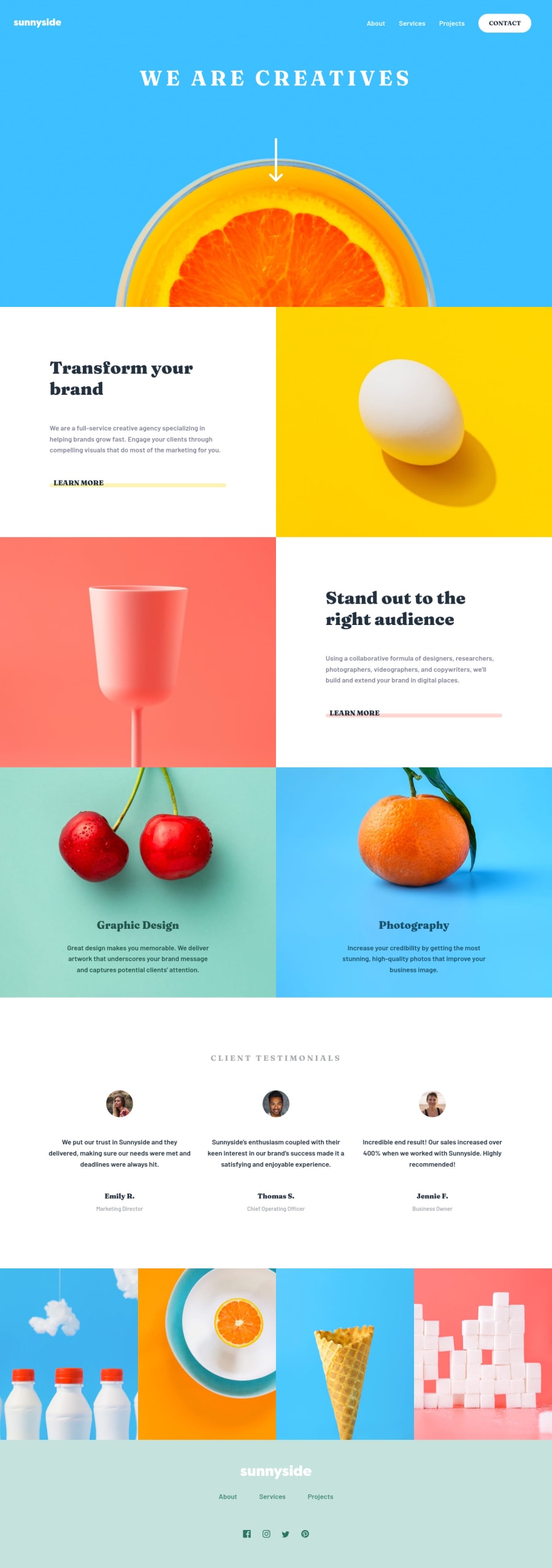
Was my approach of using an extra class, 'span-red', on a common parent element ('service-text') the right one? To make the custom underline I used ::after, but then couldn't see another way to differentiate the two spans for their different colours.
-
I couldn't figure out how to alter the footer logo to be dark-cyan instead of the original white. I tried inserting the SVG code into the HTML and setting 'Fill' but couldn't get it to take on the new fill. I couldn't see a way to do this using 'Filter' either, so I assume the SVG/Fill method is the correct method?
-
Any feedback on my JavaScript setup for the interactive elements would be appreciated.
Many thanks!
Community feedback
- @pikapikamartPosted about 3 years ago
Hey, great work on this one. Layout in desktop seems fine and for mobile state it is fine as well, but the 375px is too little. That 375px is just what it looks line for design not for breakpoint, adjusting it would be really great. Also, starting from mobile flow to desktop will be really good, trust, you'll nail those breakpoint. The responsiveness could be improved as well since right now, things are overlapping one another. You should inspect your layout in dev tools while coding it, ensuring that it will look good on all sizes.
Regarding your questions:
- Yep, it is perfectly line. Looking at your selector, the
service-text
you have reused it to all the section that looks like one another. That is really great, reusing selectors. - On the
svg
you typically use thefill
right to use on thesvg
, but sometimes, if you look in thesvg
code. You might see apath
org
element on those, and that is where you should use thefill
property. To know properly, just insert that fullsvg
code in the html. Then in your browser, inspect it, try first applying thefill
on thesvg
, if it doesn't work, apply it on thepath
if it works, then you're good:> - On javascript, the listeners for the
click
event is fine. However, for the screen size, I wouldn't use that, let the@media
query on css handle it for you. You don't need to use js on applying certain stylings to an element, especially when you want that styling applies on screen resize.
Some other suggestions would be:
- I would structure this site to be:
<header /> <main /> <footer />
So that all landmarks are visible to assistive tech.
- I wouldn't as well put the website logo inside the
nav
element, since you are not treating it as a link, just purelyimg
. I would put it in a separate container. That would be great if you made the top aheader
. - The
alt
value of the website logo should bealt="sunnyside"
. The image already has the text, better use it as thealt
value. Also, if you are adding value to thealt
attribute, do not include any word that relates to "graphic" such as "icon, images, logo, picture" avoid adding them. Just put the image description itself. - The navbar links should be inside
a
tag since those are links. - Do not put the
button
element as a child oful
. When usingul
element, onlyli
element is allowed to be a direct child element: - the arrow-down-icon's
alt
should be left empty likealt=""
. Good rule of thumb, if animg
is just for decoration, better usealt=""
, if theimg
adds any content, make a descriptivealt
value. - The orange image as well, only decorative,
alt=""
is better. - The
learn more
in every section should be usinga
tag since those are supposed links. - All the images in this website, except for the testimonial person are just purely decorative, using
alt=""
will be really good. - The position of the person after their name, I would wrap it in the same heading tag of the person, or would use a
p
on it, but not a separate heading tag. footer
website logo'salt
should bealt="sunnyside"
as well.- The links below the
footer
logo should be have used a structure like:
<nav> <ul> <li> <a /> # each individual link inside a li and inside a </li> </ul> </nav>
- The social media links should be wrapped inside a
ul
element and each inside thea
tag. For example:
<ul> <li> <a aria-label="facebook" /> # the image is inside a tag, imagine this is facebook link <li> </ul>
The
aria-label
is a piece of text that is read by assistive tech. You use this especially when an element has no text inside it, this way, if we have thataria-label
assistive tech will know that to say to the user that has navigated in that link.-
The
img
of the social media should use only their names as thealt
value or leave it blankalt=""
if you don't want it to be seen by screen readers. -
On mobile layout, the hamburger dropdown should use a
button
element instead of just usingimg
. It is more accessible compared toimg
. Then add anaria-label
to the button likealt="hamburger dropdown toggler"
, this will make sure users will know what thisbutton
does.
As I said, the responsiveness should be improved. Still, you did a good work.
Marked as helpful0 - Yep, it is perfectly line. Looking at your selector, the
Please log in to post a comment
Log in with GitHubJoin our Discord community
Join thousands of Frontend Mentor community members taking the challenges, sharing resources, helping each other, and chatting about all things front-end!
Join our Discord