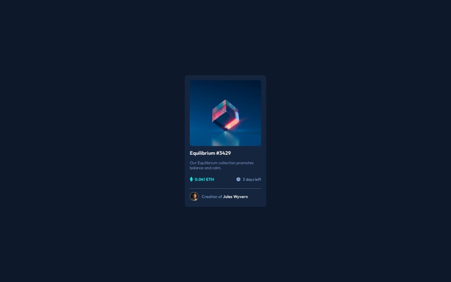


Design comparison
SolutionDesign

Solution retrospective
What are you most proud of, and what would you do differently next time?
The BEM syntax was helpful and I can benefit from my structured, readable code.
What challenges did you encounter, and how did you overcome them?pseudo elements and BEM were the biggest hurdles.
Community feedback
- @pjtetedePosted 6 months ago
Nice one here, welldone! This looks quite nice, but I have a couple of suggestions that might make it better.
- Using semantic HTML such as a <main> tag inside the <body> of your HTML is a best practice because it clearly identifies the main content of your page. Inside the <main> tag you could then us something like an <article> tag and then instead of just using the <div> tag every where, you could use other semantic tags like <header> and <footer> inside the article tag. This helps with accessibility and improves how search engines understand your content. Check here to understand Semantic HTML more
- I also noticed that the card was not properly centered. An easy way to center an element in its parent is to set its parents display to flex
display:flex;, justify the parents content to the centerjustify-content: center;as well as align-items to centeralign-items: center;. This would work especially if its the only child of its parent and its parent has a fixed height.
Your code :
body {
	font-size: 18px;
	font-family: 'Outfit', sans-serif;
	height: 100vh;
	width: 100vw;
	overflow: hidden;
	display: grid;
	place-items: center;
	background-color: var(--very-dark-blue-main);
}
What I explained above:
body {
	font-size: 18px;
	font-family: 'Outfit', sans-serif;
	height: 100vh;
	width: 100vw;
	overflow: hidden;
	/* display: grid; */ display: flex;
	/* place-items: center; */ justify-content: center;
        align-items: center;
	background-color: var(--very-dark-blue-main);
}
With the above, the card would automatically be centered on the page. Here is a comprehensive and very helpful article on flexbox
I hope these points would be helpful. Welldone and keep making progress👍🏽👍🏽👍🏽
0

Please log in to post a comment
Log in with GitHub
Join our Discord community
Join thousands of Frontend Mentor community members taking the challenges, sharing resources, helping each other, and chatting about all things front-end!
Join our Discord