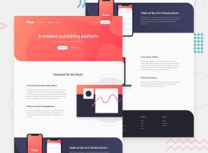
Design comparison
SolutionDesign
Solution retrospective
-
- Drop-down menu bug: On the mobile layout, when selecting the top-most menu links (product, *company, *connect), once the sub-menu expands the cursor position will then be over the following top-menu link having been shifted downwards, which then triggers that sub-menu to expand. Is there a way to avoid this behavior without using JS to handle the all the menu functionality, or manually adjust the heights of the elements so the cursor doesn't end up over another interactive element?
-
- Header SVG: Minor question, but the 'Design - Mobile' image provided shows the SVG background used in the header as having a much larger border-radius on the square. I couldn't see a way of adjusting that property of the SVG. Perhaps there was a 'mobile' version of that SVG which wasn't included? Or some CSS property affecting it?
Many thanks.
Note: This isn't a responsive layout. Only designed at the required widths, as responsiveness wasn't my learning focus here.
Community feedback
Please log in to post a comment
Log in with GitHubJoin our Discord community
Join thousands of Frontend Mentor community members taking the challenges, sharing resources, helping each other, and chatting about all things front-end!
Join our Discord
