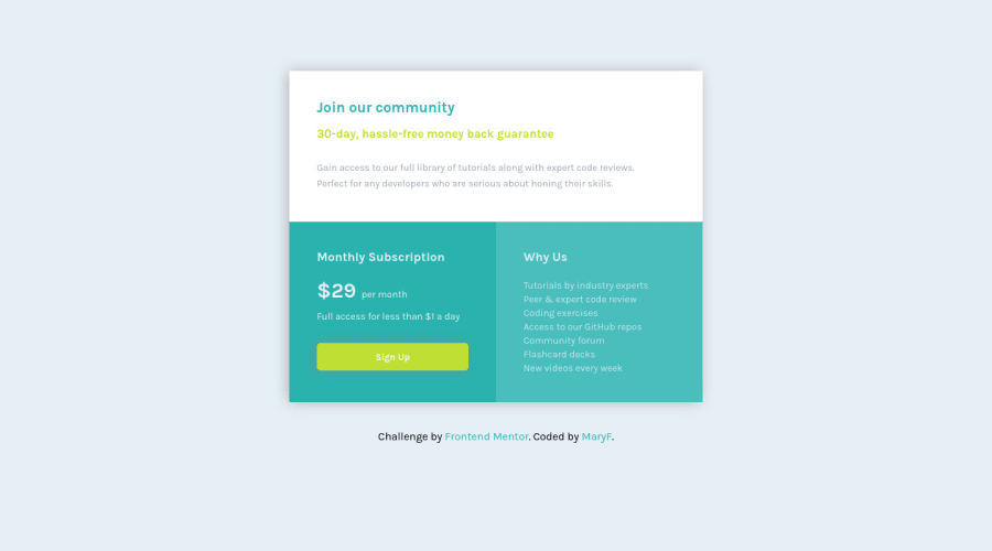
Design comparison
Solution retrospective
This is my second challenge. I solved it easier than the last time. I would like to know how I can improve my css code, I used nth-child for the divs, but still I feel i could make all the code much easier to read and work.
I struggled a little with the colors and also font sizes.
Community feedback
- @buneeIsSloPosted over 3 years ago
Hey! @Janselin, You've done great on this challenge, The site responds very well. Using the "n'th-child" property is totally fine as long as you aren't using it on a large scale project, Because then the code base becomes challenging to maintain... So I'd suggest defining a class for each div or element. Hope this helps :)
Marked as helpful1@JanselinPosted over 3 years ago@buneeIsSlo thank you alot for your time and feedback! It gives me more motivation to keep going :) I'll keep in mind about the nth-child tip!
1@buneeIsSloPosted over 3 years ago@Janselin, I'm glad I could help :3 Also the link to your github repo is incorrect, It has an extra "-" at the end. You might want to fix that. Happy Coding!
1
Please log in to post a comment
Log in with GitHubJoin our Discord community
Join thousands of Frontend Mentor community members taking the challenges, sharing resources, helping each other, and chatting about all things front-end!
Join our Discord
