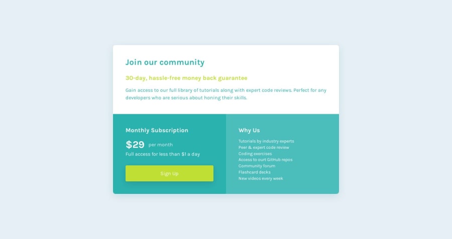
Design comparison
Solution retrospective
Any feedback/advice/criticism on general code quality is always appreciated.
Community feedback
- @sauravchamoli17Posted over 4 years ago
Hey Senatrius, Well done! 👍 on this challenge and welcome to heaven for front end developers, you will learn a lot with these awesome challenges.Your solution scales well on mobile and tablet so well done on the responsive design. Well done on using bem methodology and sass. Few things to consider in this solution are:-
- Color of the Gain access paragraph is gray as you can see in the design.
- Use aria-label attribute in the links and buttons for accessibility.
- Correct the typo on access to our github repos list item.
Congratulations on solving this challenge.
3@SenatriusPosted over 4 years ago@sauravchamoli17 Huh, so it is. Must've missed that one. And I'll be sure to look into the aria-labels, wasn't sure what they're for before. Thank you for the advice. :)
1
Please log in to post a comment
Log in with GitHubJoin our Discord community
Join thousands of Frontend Mentor community members taking the challenges, sharing resources, helping each other, and chatting about all things front-end!
Join our Discord
