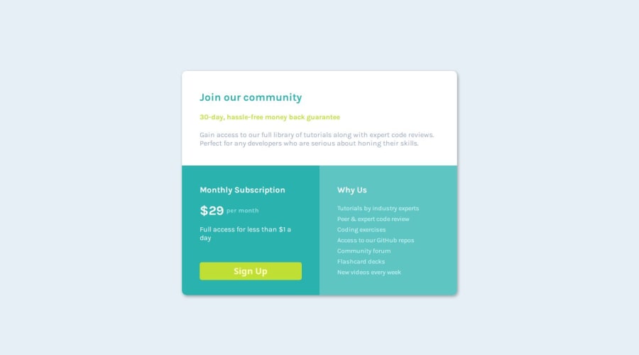
Design comparison
SolutionDesign
Solution retrospective
What are you most proud of, and what would you do differently next time?
I have learned to display and arrange divs in different positions. The next time I will try a more responsive and professional way to design the page.
What challenges did you encounter, and how did you overcome them?Challenges:
- Removing bullet points
- Applying Border Radius to the bottom of the card.
- Positioning text in the middle
Solution:
- I followed some YouTube videos
- Applied old experience
- Observed a few website's design
- Applying border-radius and using overflow to fit divs in parent div
- Displaying divs in different positions
- Applying relative value to properties in different areas
Community feedback
Please log in to post a comment
Log in with GitHubJoin our Discord community
Join thousands of Frontend Mentor community members taking the challenges, sharing resources, helping each other, and chatting about all things front-end!
Join our Discord
