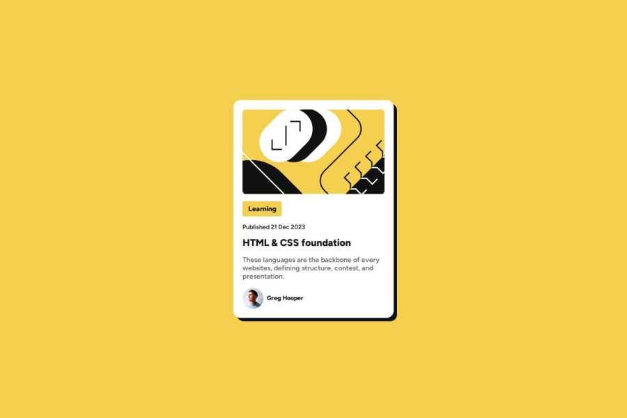
Design comparison
SolutionDesign
Please log in to post a comment
Log in with GitHubCommunity feedback
- @KeevKK
Based on my limited experience and knowledge I think you did a pretty good job.
You are using proper semantics and the code is readable.
Your css file is properly ordered in relation to your html file.
Your site is responsive.
What could be improved (You probably already know this):
- A solid border around the card
- Line height in the paragraph
- A greater padding below the main image
- A smaller avatar image
Join our Discord community
Join thousands of Frontend Mentor community members taking the challenges, sharing resources, helping each other, and chatting about all things front-end!
Join our Discord

