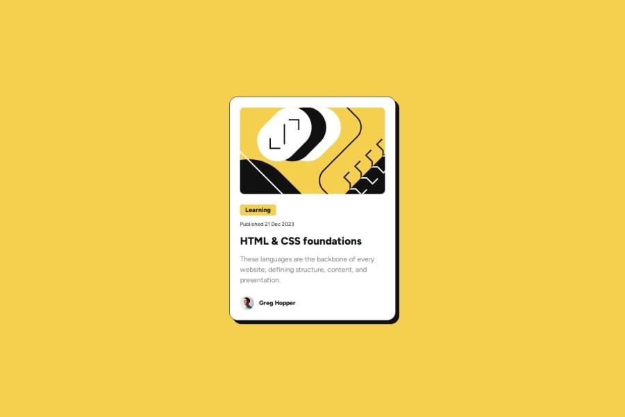
Design comparison
Solution retrospective
I'm most proud of completing the project in a shorter time than expected. However, reflecting on it, I am not sure about how I used the grid property and img.
What challenges did you encounter, and how did you overcome them?Throughout the process, I encountered challenges such as aligning images and text for the author element, which I resolved by declaring "display: inline-block". Additionally, I initially struggled with grid due missing properties, which I quickly corrected.
What specific areas of your project would you like help with?Moving forward, for the next iteration of my project, I would appreciate assistance in resolving different font-size in mobile view without using media queries, as suggested during the challenge
Community feedback
- P@denissejoycePosted 11 months ago
Hey there! Good job on completing the project 🎉 You can try using clamp() to modify a text's font size without the use of media queries.
Marked as helpful1@thetinyelephant85Posted 11 months ago@denissejoyce that's how I can control text size without media queries, thank you so much!
0
Please log in to post a comment
Log in with GitHubJoin our Discord community
Join thousands of Frontend Mentor community members taking the challenges, sharing resources, helping each other, and chatting about all things front-end!
Join our Discord
