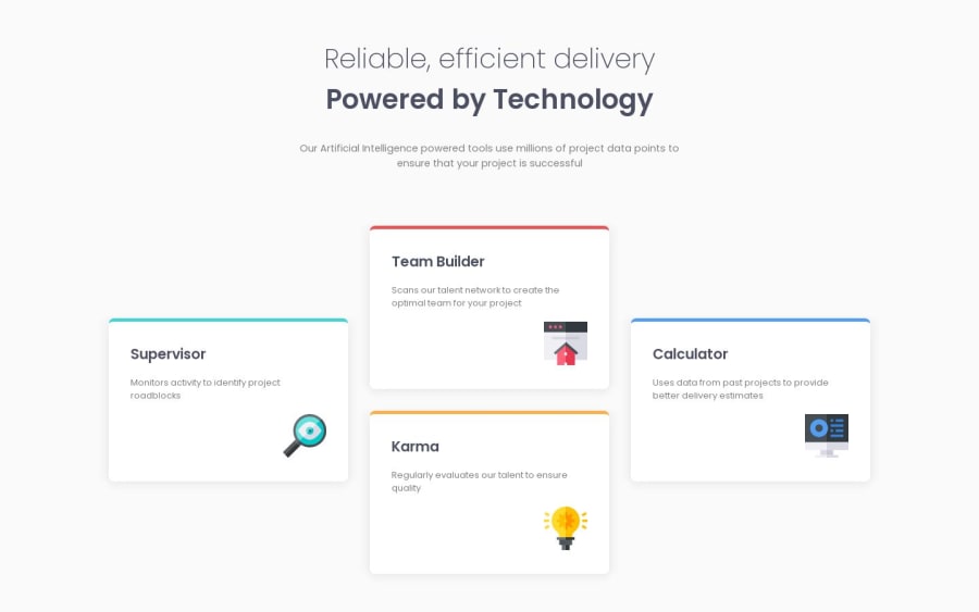
Design comparison
Solution retrospective
I'm not sure if my grid layout approach is optimal. If you have any feedback or if I've included unnecessary elements, I would appreciate your guidance and corrections. Thank you.
Community feedback
- @VCaramesPosted about 1 year ago
Hey there! 👋 Here are some suggestions to help improve your code:
- For the icons, just leave the
altblank, no foralt="_blank".
- There's no need to do this
#grid-blocks>div:nth-child(3), it only complicates things. Instead give the card aclassand use that for styling.
- Using
CSS GridwithGrid-Template-Areaswill make things way easier 💯 when building the layout; it will give you full control of the layout.
- I would definitely add ⚠️ a third layout between, maybe, 650 - 1000px as your layout is just a single column until 1440px.
- You definitely want to use
variables, at minimum, for your colors as it will help keep things organize and easier to maintain.
If you have any questions or need further clarification, feel free to reach out to me.
Happy Coding! 👾
0@IntroxietyPosted about 1 year ago@vcarames I appreciate your feedback. Your mention of grid template areas and variables prompted me to do some research, and I can see how they could simplify the coding process. As for the use of #grid-blocks>div:nth-child(3), I experimented with it as I thought it might come in handy for future projects. Your insights have been valuable, and I'm looking forward to applying these techniques in my work.
0 - For the icons, just leave the
- @freaky4wrldPosted about 1 year ago
Hey there, I think you have to work on the four card positioning, because it doesn't look same as the challenge specifies, here's what I would suggest.
- You make 3 divs and make there div container flex-direction as row with spacing in between
- Now add to the middle div add two card elements like the one in the challenge and make this div container flex-direction of these card as column and remember to add the same spacing as you have used to add space between these three divs.
Here's how it look likes in code:
     <div class = 'card-left'>
         <div class='cards'>
     </div></div>
     <div class = 'card-mid'>
          <div class='cards'></div>
         <div class='cards'></div>
    </div>
     <div class='card-right'>
         <div class='cards'></div>
    </div>
Hope it helps you!!!
0@IntroxietyPosted about 1 year ago@freaky4wrld I'm sorry I think I cannot do what you said because the container is 2 dimensional so the better approach is to use grid not flex. I get what you say it would surely work but grid is a better approach here.
0@freaky4wrldPosted about 1 year ago@Introxiety Well your choice man, I'm just showing you the alternative way to do it..... and it's cool to have your own preferences
0
Please log in to post a comment
Log in with GitHubJoin our Discord community
Join thousands of Frontend Mentor community members taking the challenges, sharing resources, helping each other, and chatting about all things front-end!
Join our Discord
