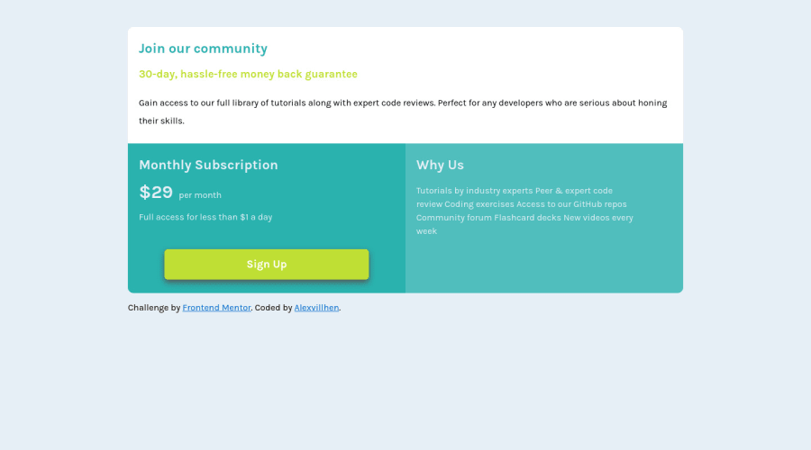
Design comparison
SolutionDesign
Solution retrospective
pls leave your feedback😁
Community feedback
- @waltersonoPosted over 3 years ago
Hi alexvillhen
Nice work
Here are my suggestions:
-
Use the headings in order
- You use a h2 but there is no h1, this causes confusion for screen readers users
- You could have used h1 for "Join our community" and h2 for the other titles
- You can see by the design that "Join our community" is bigger then the other titles
-
Avoid using "ems" for margin
- This unit is relative to the current font-size, and the global font-size. It multiplies
- Use rem instead
-
Add hover effect to the button
- This will make the user experience better
Ok alexvillhen, hope this is helpful.
Keep working.
1 -
- @vanzasetiaPosted over 3 years ago
👋Hi Alejandro Villaescusa!
I have some feedback to improve this solution:
- In my opinion, the
line-heightfor.white .descriptionis too big, try to decrease it to1.6. - I think your CSS would be much cleaner if you use
Prettierand then set thetab-widthto2.
That's it! Hopefully this is helpful!
0 - In my opinion, the
Please log in to post a comment
Log in with GitHubJoin our Discord community
Join thousands of Frontend Mentor community members taking the challenges, sharing resources, helping each other, and chatting about all things front-end!
Join our Discord
