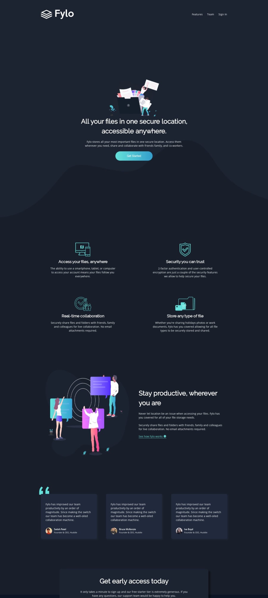
Design comparison
Solution retrospective
- Are there any obvious accessibility issues?
- I pretty much freestyled the class names and organization, is there anything you recommend I focus on ?
- I tried to make it so that on larger screens, the introduction takes up the whole viewport so that the rest is only seen when you scroll, does it seem like a good idea/well executed?
Community feedback
- @mattstuddertPosted over 4 years ago
Hey Samy, nice work on this challenge! It's great to see you asking very specific questions. I've taken a look at your project and here are my answers:
- The only thing I'd review for accessibility purposes would be the email
input
. I'd change thetitle
attribute toaria-label
. This ensures that the value of that attribute is read out by screen readers. Otherwise, they'll typically read out the placeholder text which wouldn't be very helpful. - Your naming is fine. It will come with time but there are techniques out there that you might find useful. For example, I'd recommend looking into BEM naming conventions. A lot of developers use it and it works well.
- Everything looks great on a larger screen, so you've done a great job with this.
I hope that helps. Keep up the great work!
1@anaielPosted over 4 years agoThanks for the review! I used the title attribute after reading this page: https://www.w3.org/TR/WCAG20-TECHS/H65.html but I'll admit I don't know much about aria attributes yet so I'll look into it. I'll also make sure to check out BEM naming conventions.
0@mattstuddertPosted over 4 years ago@anaiel ah OK. My screen reader still read out the placeholder text. I'd stick with
aria-label
anyway just to be sure. Aria attributes are definitely worth looking into 👍1 - The only thing I'd review for accessibility purposes would be the email
Please log in to post a comment
Log in with GitHubJoin our Discord community
Join thousands of Frontend Mentor community members taking the challenges, sharing resources, helping each other, and chatting about all things front-end!
Join our Discord