Design comparison
SolutionDesign
Solution retrospective
Any suggestion is welcome
Community feedback
- @hardy333Posted about 3 years ago
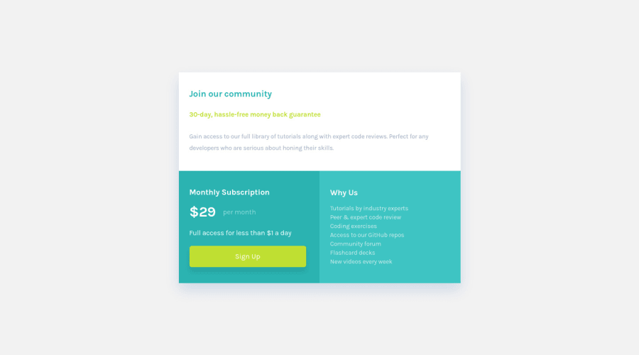
Hey, website looks very good and clean. It is also responsive - good job.
Several suggestions here:
- You can use <main></main> semantic element instead of role="main" on div element, using HTML 5 semantic tags are considered better practice, you can also combine both of them.
- try to use <ul></ul> instead of <p> and <br> tags on last section, those are list and list items more then hole paragraph...
Good luck and have a nice day.
Marked as helpful3 - @benjoquilarioPosted about 3 years ago
Great job on finishing this one, It looks good and response very well.
Aside from hardy suggestion, My small suggestion is to add a
cursor: pointer;sign up button, to inform the user that this is clickable.keep coding!
Marked as helpful2 - @HappyAtom3Posted about 3 years ago
great job, everything looks very good.
Congratulations on solving this challenge.
1
Please log in to post a comment
Log in with GitHubJoin our Discord community
Join thousands of Frontend Mentor community members taking the challenges, sharing resources, helping each other, and chatting about all things front-end!
Join our Discord
