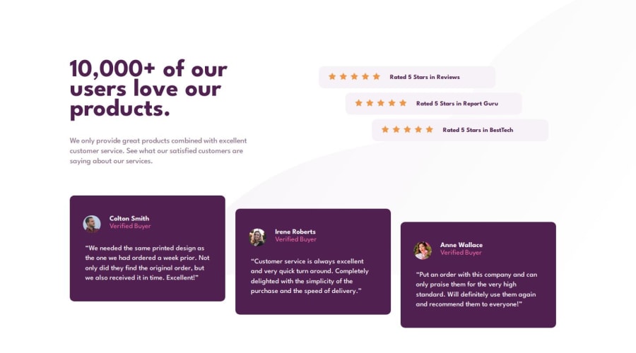


Design comparison

Solution retrospective
I'm proud of my use of grids - I feel I understand it well. I'd like to make use of grid-area next.
I wish I had simplified the responsive design earlier. I think I overdid it, although it works well. I could've made the <main> a flex row in an earlier media query and then perhaps had less of them to write.
It was somewhat challenging to arrive at the staggered grid effects, but I understand how to approach it and it wasn't as hard as I thought it could be. It just took a bit of time.
I found making this design responsive difficult. I had 3 main sections to work with - <header>, <aside> for the ratings and <section> for the reviews. My original design had a flex-row with wrap. This ended up getting difficult as I scaled the viewport down to mobile. I'm not sure if there was a simpler way. I spent longer on this than I would've liked.
I also had a hard time with the bg-img and I don't feel confident positioning these yet, especially when it comes to adjusting for responsiveness. I'd like support with this.
What specific areas of your project would you like help with?- Please review my Sass and let me know how I could make better use of it here.
- Please test the responsiveness and see where you think it could be improved.
- How can I use bg-img well in this design? I positioned it correctly for desktop but it's not responsive and it doesn't cover the entire viewport, it cuts off. I'm not confident with those properties yet so I'd appreciate help with this!
Please log in to post a comment
Log in with GitHubCommunity feedback
- @dar-ju
Hi IO!
I like your work, good responsiveness, the code is structured conveniently, reads well. I would probably only pay attention to the fact that at a resolution of 1024 pixels there is quite a lot of free space on the sides. You can make the blocks a little wider at this resolution.
-
You are not using semantic tags quite correctly. For example, this page should not have a header tag. Header is a through tag of the upper part of the site, usually there is a logo, menu, something else. Header is used outside of main, above.
-
All this is one section, where there is a title (h1), description (p), rating (div) and a review card (article) *3
-
The aside tag is the same part of the site as the header, which can be found on many pages, for example, this is the part with advertising banners or a product filter. In this task, it is part of the section, not aside.
-
Stars here are decorative images, in this case, alt is not filled in. Information from alt is read by search engines and readers. Imagine, the reader will read the words "star icon" 15 times %)
-
Styling tags is a bad practice. Imagine that you add a new section with products, they will have their own styles. You will have to rewrite everything. Get into the habit of assigning classes to all tags and styling the classes.
-
margin: 100px 100px;you can write it shorter, justmargin: 100px; -
ALWAYS check your layout for overflow, add blocks, add text and see how the layout behaves. For example, if you add 4th rating block, your layout will break. This is important because the customer can change something - add / delete and your layout must be stable.
Otherwise, everything is great, good luck with the development!
Marked as helpful -

Join our Discord community
Join thousands of Frontend Mentor community members taking the challenges, sharing resources, helping each other, and chatting about all things front-end!
Join our Discord