Design comparison
Community feedback
- @correlucasPosted over 2 years ago
👾Hello Daniel Blum, congratulations for your new solution!
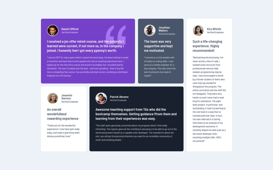
Your solution is amazing, I can see you've paid a lot of attention to the details. One thing you've missed is the purple border around the profile photo inside the black and purple card.
About the semantics you can replace the
<div>that wraps each card with<article>and the paragraph with the quote with the property tag<blockquote>this way you'll wrap each block of element with the best tag in this situation. Pay attention that<div>is only a block element without meaning.👋 I hope this helps you and happy coding!
1@dnlblumPosted over 2 years ago@correlucas Thank you very much for evaluating my code for this challenge. You are right, I missed the basic semantics in this challenge due to the fact that it was my first attempt with Grid. I will fix the semantic tags in my next commit. And also the border colors that I didn't realize at first that it changes color.
Cheers, and thank you.
1
Please log in to post a comment
Log in with GitHubJoin our Discord community
Join thousands of Frontend Mentor community members taking the challenges, sharing resources, helping each other, and chatting about all things front-end!
Join our Discord
