Design comparison
Community feedback
- P@rmmcfarlinPosted about 2 months ago
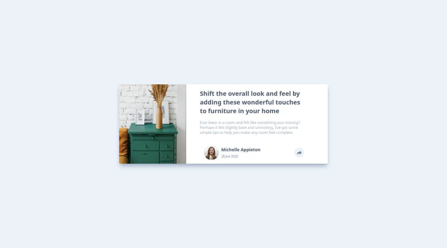
Your solution looks good, very close to the original design. Padding / margins and proportion of the image to the text section could be improved to get it pixel-perfect, but the solution still looks good and is close enough. Could add some semantic HTML for accessibility. Overall though, looks great!
1@proAbenezerPosted about 2 months ago@rmmcfarlin thank you I will try to perfect the site
0 - @khatri2002Posted about 2 months ago
Hi @proAbenezer!
The developed solution looks great!
I just have a minor suggestion that you may find worth implementing:
The
drawersimage appears to be slightly stretched, as it is unable to maintain its original aspect ratio. To fix this, consider adding the Tailwind classobject-cover(object-fit: cover). This ensures that the image takes up all the available space while maintaining its aspect ratio by cropping it equally from both the right and left sides.However, upon reviewing the design reference, it appears that the image is only being cropped from the right side, not the left. To align with the design reference, you can also add the
object-leftclass (object-position: left), which will ensure that the image is aligned properly.The rest of the solution looks great! Keep up the excellent work! 🚀
0@proAbenezerPosted about 2 months ago@khatri2002 Thanks a lot for your suggestion! I implemented object-cover along with object-left, and it worked perfectly. Now the image maintains its aspect ratio while aligning correctly with the design reference. I really appreciate your keen eye for detail and your helpful feedback!
Thanks again, and looking forward to more of your insights!
1
Please log in to post a comment
Log in with GitHubJoin our Discord community
Join thousands of Frontend Mentor community members taking the challenges, sharing resources, helping each other, and chatting about all things front-end!
Join our Discord
