Submitted over 1 year ago
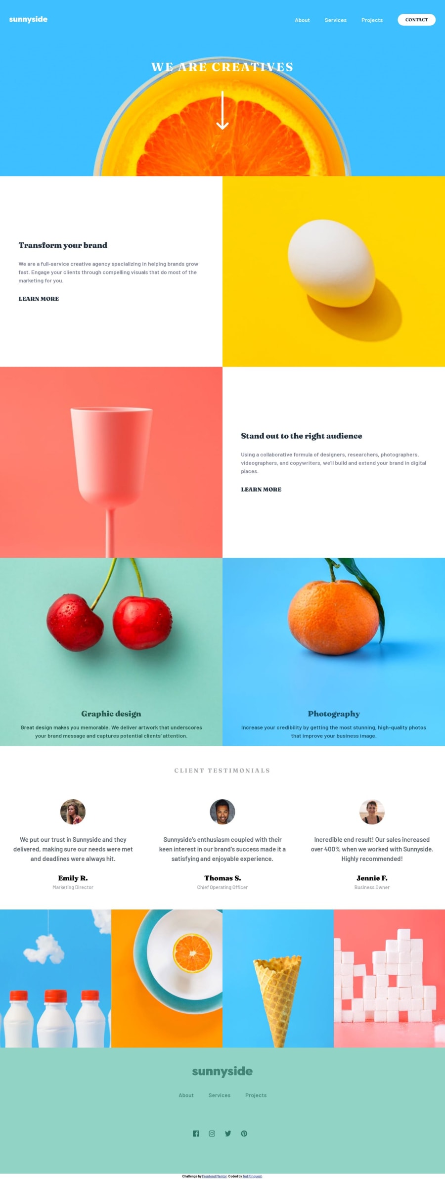
Great task for a "speed run" with a quick Grid layout + flyout menu
@climb512
Design comparison
SolutionDesign
Solution retrospective
Things learned and decisions made:
- Layout: How to structure elements in html when some sections change ordering between mobile/desktop.
- Defining geometric shapes (right triangle) in css using border settings.
- Pros and cons of using background-image: url(xyz); rather than <img src="xyz">
- More practice with CSS-Grid and grid-areas.
- Interesting hover effects using psuedo-elements.
- Using svg color filters.
Community feedback
Please log in to post a comment
Log in with GitHubJoin our Discord community
Join thousands of Frontend Mentor community members taking the challenges, sharing resources, helping each other, and chatting about all things front-end!
Join our Discord
